Brazil REVAMP [Abandoned]
Moderator: Cartographers
Forum rules
Please read the Community Guidelines before posting.
Please read the Community Guidelines before posting.
-
unriggable

- Posts: 8036
- Joined: Thu Feb 08, 2007 9:49 pm


Well, I talked already about some of this to Pengui. Anyway, I will also post here to see what you think.
Wasted space: of course some wasted space will remain, due to Brazil shape. But of course the opinions are right. That space out of the parchment should be removed. In fact, the map can really be bigger.
The "desert" floor: maybe, Pengui, try that texture, but with the SA dead space and a an ocean?? Of course, not yellow like now, but with neutral colours? It will add a better aspect to the map, in my opinion, and wouldnt be very difficult, I think.
I also dont like too much the hovering aspect of the font, although Im not placing a veto to it... In fact, i dislike the font much more because: 1) "i" and "l" are like the same thing; 2) No cap "p", and mainly "g" are no good, dont you think?
To this I will use my veto powers: move the credits out of the Brazilian flag, mate. I bet you all were expecting it already, lol.
About the colours, maybe Molacole or someone else can give us a hand. I think its fine (although we will need some adjustments between continents colours and the colours in the legend). And about the armies circles, I like more the white ones.
Molacole is right about something else. Non crossable borders must be identified in the legend. They were identified, and I still got people surprised by the non attack effect, lol.
Plus, a quick spell error: Juazeiro, not Juazeira
Its all for now.
Wasted space: of course some wasted space will remain, due to Brazil shape. But of course the opinions are right. That space out of the parchment should be removed. In fact, the map can really be bigger.
The "desert" floor: maybe, Pengui, try that texture, but with the SA dead space and a an ocean?? Of course, not yellow like now, but with neutral colours? It will add a better aspect to the map, in my opinion, and wouldnt be very difficult, I think.
I also dont like too much the hovering aspect of the font, although Im not placing a veto to it... In fact, i dislike the font much more because: 1) "i" and "l" are like the same thing; 2) No cap "p", and mainly "g" are no good, dont you think?
To this I will use my veto powers: move the credits out of the Brazilian flag, mate.
About the colours, maybe Molacole or someone else can give us a hand. I think its fine (although we will need some adjustments between continents colours and the colours in the legend). And about the armies circles, I like more the white ones.
Molacole is right about something else. Non crossable borders must be identified in the legend. They were identified, and I still got people surprised by the non attack effect, lol.
Plus, a quick spell error: Juazeiro, not Juazeira
Its all for now.


-
Qwert

- SoC Training Adviser
- Posts: 9262
- Joined: Tue Nov 07, 2006 5:07 pm
- Location: VOJVODINA
- Contact:
KEYOGI
Cartography Assistant
Joined: 10 Oct 2006
Posts: 1437
Posted: 25 Jul 2007 12:26 Post subject:
--------------------------------------------------------------------------------
There really is an excess of wasted space here. I think you could probably make the map itself an extra 100px bigger and fill in all that empty space. You would perhaps need to move the title to the top-right corner and the flag down to the bottom-right corner. I don't see why this should cause any problems for Marv or yourself.alstergren wrote:
Looking at the pics, the actual map occupies about half of each picture.
I agree with these,when i look new update,i se that you have to many empty space.


-
The Fuzzy Pengui

- Posts: 2271
- Joined: Mon Nov 27, 2006 6:52 pm
- Gender: Male
- Location: Ohio
Just got back from a couple days of camping.
Thank you for the feedback, it may not be positive, but it's constructive 
I will of course be changing what Marvaddin has suggested first, since he is the original mapmaker
I know not everyone will be pleased with the final map, but I hope to please more of you than I am now (although I'm not sure that I will only use 4 colors, I will take everyone's feedback into consideration)
Thank you again
Thank you for the feedback, it may not be positive, but it's constructive
I will of course be changing what Marvaddin has suggested first, since he is the original mapmaker
I know not everyone will be pleased with the final map, but I hope to please more of you than I am now (although I'm not sure that I will only use 4 colors, I will take everyone's feedback into consideration)
Thank you again
Gilligan wrote:I'M SO GOOD AT THIS GAME
My stepmom locked the bathroom door
So I opened the lock with my shoelace
-
Optimus Prime

- Posts: 9665
- Joined: Mon Mar 12, 2007 9:33 pm
- Gender: Male


-
The Fuzzy Pengui
- Posts: 2271
- Joined: Mon Nov 27, 2006 6:52 pm
- Gender: Male
- Location: Ohio
Thanks to both of you, and sorry to everyone for not having an update for a while. I hope to get one soon, but I am working a lot (from 3pm-12am) and pretty much sleep, work at home, and go to work. I hope that I am able to get an update soon, and I will continue working, and improvinggimil wrote:It like this some more than others.Coleman wrote:Hang in there Fuzzy, it's like this for everyone. Except maybe Jota.
I think what you have is already an improvement over the original art.
Gilligan wrote:I'M SO GOOD AT THIS GAME
My stepmom locked the bathroom door
So I opened the lock with my shoelace
-
chessplaya
- Posts: 1875
- Joined: Sat Jan 20, 2007 1:46 pm
-
The Fuzzy Pengui
- Posts: 2271
- Joined: Mon Nov 27, 2006 6:52 pm
- Gender: Male
- Location: Ohio
I don't know what to say....I feel so...honoredchessplaya wrote:u r doing a great job fuzzy boy ... i am gonna actually take a picture for me with this map in my background
keep up the good work!
Gilligan wrote:I'M SO GOOD AT THIS GAME
My stepmom locked the bathroom door
So I opened the lock with my shoelace

-
The Fuzzy Pengui
- Posts: 2271
- Joined: Mon Nov 27, 2006 6:52 pm
- Gender: Male
- Location: Ohio
Yes, a lot of people keep mentioning the impassable borders.wicked wrote:don't know if it's been brought up yet, but can you make the impassable borders either darker or a different texture? How it is now makes it hard to see the openings like in Tocantins & Oeste Paulista, especially with the crowded text near the latter.
People must not have seen me ask before, so I will ask again.
Does anybody have an idea on what to do for the impassable borders? I am at a loss on how to create them/what they should look like
Gilligan wrote:I'M SO GOOD AT THIS GAME
My stepmom locked the bathroom door
So I opened the lock with my shoelace
-
AndyDufresne

- Posts: 24919
- Joined: Fri Mar 03, 2006 8:22 pm
- Location: A Banana Palm in Zihuatanejo
- Contact:
-
The Fuzzy Pengui
- Posts: 2271
- Joined: Mon Nov 27, 2006 6:52 pm
- Gender: Male
- Location: Ohio
I can try a mountain look. The only thing is that since there are no mountains in real life, if we are trying to keep this life-like, that is a problem. I will play around with it and see what i findAndyDufresne wrote:With the current style of the map, perhaps you could look into some sort of graphic representation of mountains? They'd have to feel very much like this map does...light, soft, and sandy almost. I'd look into playing around with some images and textures and looks.
--Andy
Gilligan wrote:I'M SO GOOD AT THIS GAME
My stepmom locked the bathroom door
So I opened the lock with my shoelace
-
WidowMakers
- Posts: 2774
- Joined: Mon Nov 20, 2006 9:25 am
- Gender: Male
- Location: Detroit, MI
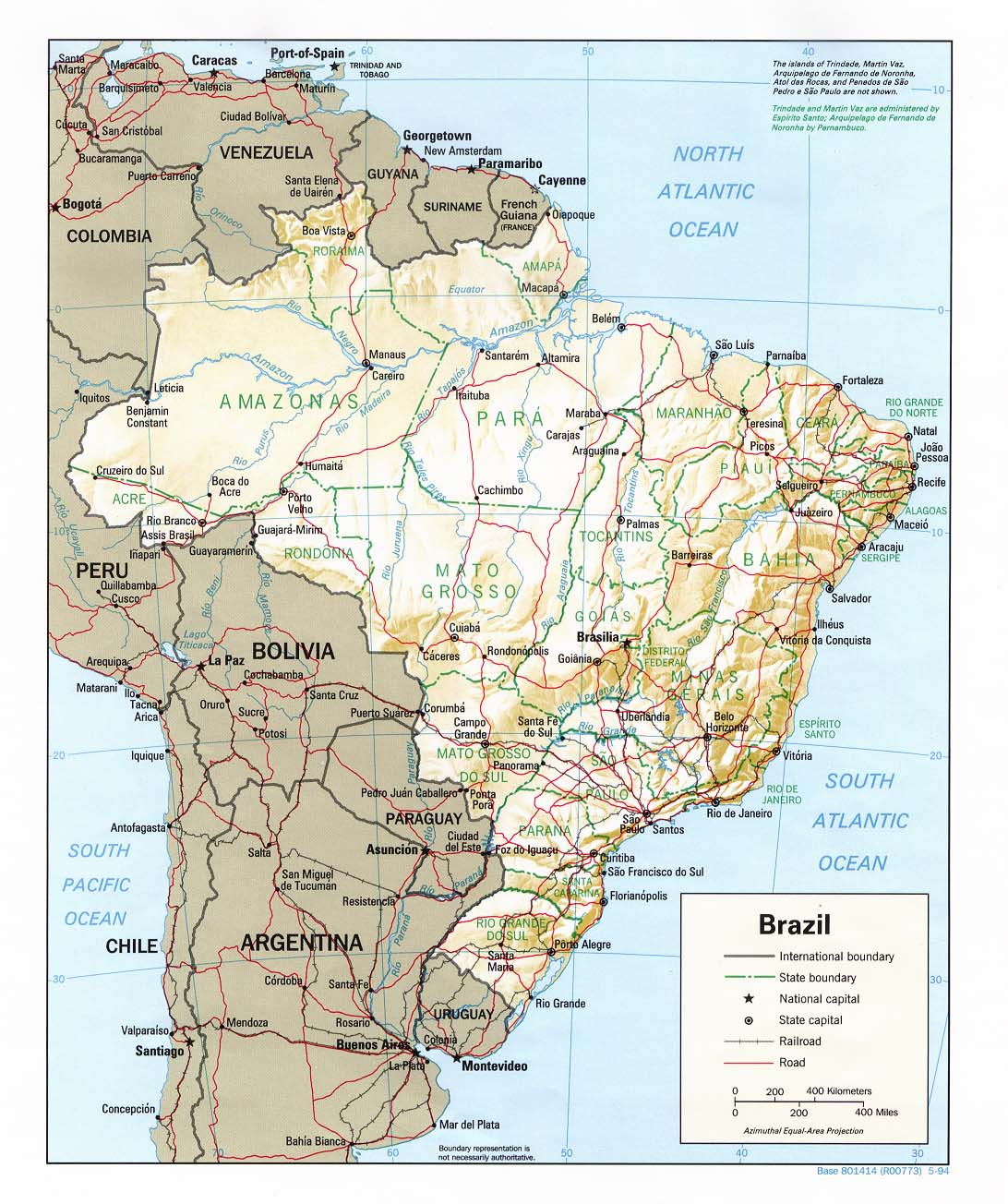
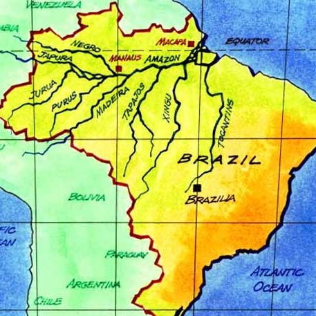
I agree. Looking at some maps, there are not many geographical feature that help with impassable borders. Here are some maps. You might be able to use some of the rivers as borders. It would be changing the way the borders look but not actually changing the way they play.The Fuzzy Pengui wrote:I can try a mountain look. The only thing is that since there are no mountains in real life, if we are trying to keep this life-like, that is a problem. I will play around with it and see what i findAndyDufresne wrote:With the current style of the map, perhaps you could look into some sort of graphic representation of mountains? They'd have to feel very much like this map does...light, soft, and sandy almost. I'd look into playing around with some images and textures and looks.
--Andy
Right now you seemed to have just redrawn the old map with better lines and colors. If that is what you want to do then the impassables will just need to be drawn (IMHO) as thinker different colored lines and then lets move on.
Otherwise you will need to change the look of the territories to some of the rivers while maintaining the XML borders.
I guess if the first option is used, I would make the impassables in the legend called "uncrossable political boundaries" or something like that.
WM

-
AndyDufresne
- Posts: 24919
- Joined: Fri Mar 03, 2006 8:22 pm
- Location: A Banana Palm in Zihuatanejo
- Contact:
Hey, friends!
When keyogi asked me restrictions about the revamp project, the 1st thing I have mentioned: the unpassable borders arent natural, they arent mountains or rivers... Look at the first map widowmakers have posted... I based myself on the political map, so the unpassable are normal state borders, mostly without any natural thing. So, I think we shouldnt put a river where it doesnt exists in real life
I think the best way is put something like a barricade... alike to what we had in the eastern front map.
-
The Fuzzy Pengui
- Posts: 2271
- Joined: Mon Nov 27, 2006 6:52 pm
- Gender: Male
- Location: Ohio
Just thought I would stop in and let you know I am still working on the map, and trying to implement the aforementioned ideas. I am sorry it's coming slowly, but I want it to be just right 
Gilligan wrote:I'M SO GOOD AT THIS GAME
My stepmom locked the bathroom door
So I opened the lock with my shoelace

How about dense rainforest as natural borders? Isn't Brazil full of that?
I would personally really prefer natural borders, impassible state borders don't make much sense to me. It would be very logical to use the Amazon and its biggest subsidiairies as natural borders. Why do they have to be the same as the ones on the current map?
And can we have slightly more imaginative names for the continents? How about Amazonas for Northwest, Pará for Central North?
-
The Fuzzy Pengui
- Posts: 2271
- Joined: Mon Nov 27, 2006 6:52 pm
- Gender: Male
- Location: Ohio
All of that is up to Marvaddin. He told me to start out that it was only a graphical revamp. Therefore, all borders, names, etc have to stay the same. As of right now they have to stay the same, but if Marv would agree to change them, then they could be changed. It's all up to himjasnostj wrote:How about dense rainforest as natural borders? Isn't Brazil full of that?
I would personally really prefer natural borders, impassible state borders don't make much sense to me. It would be very logical to use the Amazon and its biggest subsidiairies as natural borders. Why do they have to be the same as the ones on the current map?
And can we have slightly more imaginative names for the continents? How about Amazonas for Northwest, Pará for Central North?
Gilligan wrote:I'M SO GOOD AT THIS GAME
My stepmom locked the bathroom door
So I opened the lock with my shoelace
-
Ruben Cassar

- Posts: 2160
- Joined: Thu Nov 16, 2006 6:04 am
- Gender: Male
- Location: Civitas Invicta, Melita, Evropa
Sorry but I prefer the original. Was there any need for a revamp after all? The original, while not having outstanding graphics was simple and clear.
In this revamp version the colours are not so clear. The territories seem kind of crammed up and confusing!!! The borders and the impassables are not as crisp and clear as the original either and personally I find myself straining my eyes trying to understand what's going on.
Sorry I don't want to be negative or to offend anyone but...
Can't we leave the original map as it is???


-
The Fuzzy Pengui
- Posts: 2271
- Joined: Mon Nov 27, 2006 6:52 pm
- Gender: Male
- Location: Ohio
Negative is fine...it's constructive, so I don't mind.Ruben Cassar wrote:Sorry but I prefer the original. Was there any need for a revamp after all? The original, while not having outstanding graphics was simple and clear.
In this revamp version the colours are not so clear. The territories seem kind of crammed up and confusing!!! The borders and the impassables are not as crisp and clear as the original either and personally I find myself straining my eyes trying to understand what's going on.
Sorry I don't want to be negative or to offend anyone but...
Can't we leave the original map as it is???
As i have said countless times before (nobody notices
I am changing the text, and enlarging the map so it is clearer and easier to read.
I am also simplifying things a bit, and making everything more faded/muted so it isn't as vibrant/bold when looking at it.
Gilligan wrote:I'M SO GOOD AT THIS GAME
My stepmom locked the bathroom door
So I opened the lock with my shoelace