Netherlands [Quenched]
Moderator: Cartographers
Forum rules
Please read the Community Guidelines before posting.
Please read the Community Guidelines before posting.


you didn't really 'fix' that line. you just made it thinner. If I'm the only one who has a problem with it, then just leave it be I guess. I just think it looks really silly there and nothing is lost without it.
As for the water, I liked the old colour better. Can you try out a different colour for the southwest land instead?
As for the water, I liked the old colour better. Can you try out a different colour for the southwest land instead?
-
Lone.prophet
- Posts: 1467
- Joined: Thu Oct 12, 2006 4:37 pm
- Location: Your basement Muahaha

-
Lone.prophet
- Posts: 1467
- Joined: Thu Oct 12, 2006 4:37 pm
- Location: Your basement Muahaha
-
Lone.prophet
- Posts: 1467
- Joined: Thu Oct 12, 2006 4:37 pm
- Location: Your basement Muahaha
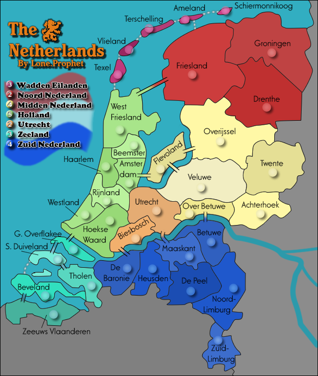
this is good. Only two things I would personally change.
1. Decrease the size of the shadow for the title. I just think slightly smaller would go a long way. But, just an opinion.
2. Remove the line at the bottom. To me it just looks weird. It's the only one on the whole map and you don't lose anything if you remove it (also I don't think it adds anything). But, again just an opinion.
I actually really like this new fresh look, good work LP. As usual, I have a few suggestions though. 
The colours of Wadden Eilanden and Noord Nederland are probably a bit too similar to each other. I really like the new colour scheme, it works wonders. But perhaps a bit more purple and less magenta for Wadden Eilanden would help.
Perhaps consider reducing the size of the font for the territory labels. It's really squeezing you for room in some territories. Also, are you sure those army circles are big enough, they look a little on the small side.
I think the numbers in the legend are a little hard to read. It looks like you have an inner shadow on the number itself, so perhaps just play around with settings, but I really have to struggle to read the bonus values for Holland and Midden Nederland.
Those are the most obvious issues for me. You could perhaps add the black line along the river, but that's up to you. Also, maybe the use of faint textures around the map could give the whole thing a nice finish.
Again, I really like the updated map. Keep up the good work.

-
AndyDufresne

- Posts: 24919
- Joined: Fri Mar 03, 2006 8:22 pm
- Location: A Banana Palm in Zihuatanejo
- Contact:


-
Lone.prophet
- Posts: 1467
- Joined: Thu Oct 12, 2006 4:37 pm
- Location: Your basement Muahaha
-
gimil

- Posts: 8599
- Joined: Sat Mar 03, 2007 12:42 pm
- Gender: Male
- Location: United Kingdom (Scotland)
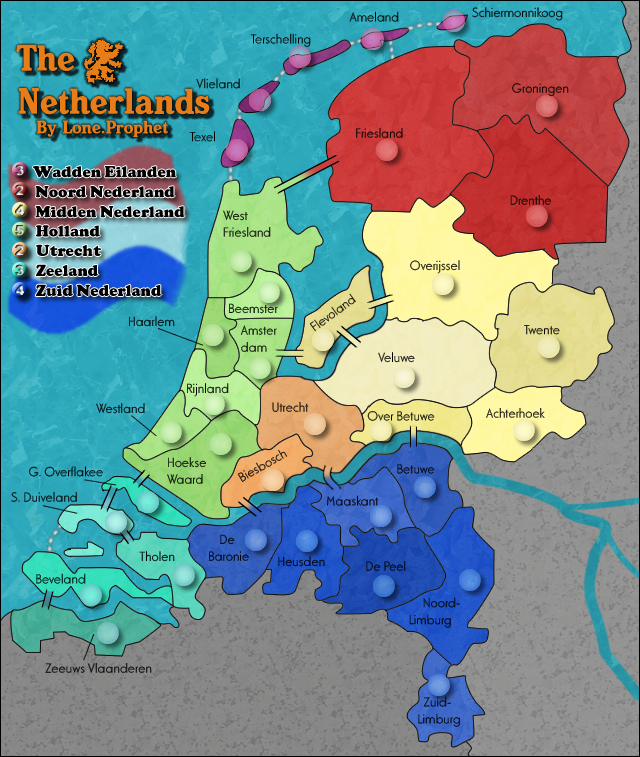
The texture need to be stronger in every terr except the red continent. I'm also not a big fan of the texture you used in the dead area. To intrusive. It needs to be something subtle and consistent. Its to distracting at the moment.
What do you know about map making, bitch?
Top Score:2403natty_dread wrote:I was wrong
-
Lone.prophet
- Posts: 1467
- Joined: Thu Oct 12, 2006 4:37 pm
- Location: Your basement Muahaha


-
Lone.prophet
- Posts: 1467
- Joined: Thu Oct 12, 2006 4:37 pm
- Location: Your basement Muahaha
-
gimil
- Posts: 8599
- Joined: Sat Mar 03, 2007 12:42 pm
- Gender: Male
- Location: United Kingdom (Scotland)
Dont twist words, not cool. Just because people didn't like doesn't mean all aspect of the old version should be lost.
The textres are now fine. We didnt say 3D we said we wanted the map to have a bit more of a kick.
The textres are now fine. We didnt say 3D we said we wanted the map to have a bit more of a kick.
What do you know about map making, bitch?
Top Score:2403natty_dread wrote:I was wrong
-
Lone.prophet
- Posts: 1467
- Joined: Thu Oct 12, 2006 4:37 pm
- Location: Your basement Muahaha
-
Lone.prophet
- Posts: 1467
- Joined: Thu Oct 12, 2006 4:37 pm
- Location: Your basement Muahaha