Hm, I kind of like the idea of that legend...but perhaps instead of having grouped bubbles...simply elminate the bubble and have a giant bubble of that color? Not sure if that makes sense. Anyways, I think you could keep the circle around the numbers, but join all the continent bubbles together into one perhaps.
--Andy
WWII Pearl Harbor - [Quenched]
Moderator: Cartographers
![]() by AndyDufresne on Fri Aug 31, 2007 9:33 am
by AndyDufresne on Fri Aug 31, 2007 9:33 am
-

 AndyDufresne
- Posts: 24935
- Joined: Fri Mar 03, 2006 8:22 pm
- Location: A Banana Palm in Zihuatanejo


![]() by cairnswk on Fri Aug 31, 2007 11:22 am
by cairnswk on Fri Aug 31, 2007 11:22 am
AndyDufresne wrote:Hm, I kind of like the idea of that legend...but perhaps instead of having grouped bubbles...simply elminate the bubble and have a giant bubble of that color? Not sure if that makes sense. Anyways, I think you could keep the circle around the numbers, but join all the continent bubbles together into one perhaps.
--Andy
How is this Andy?
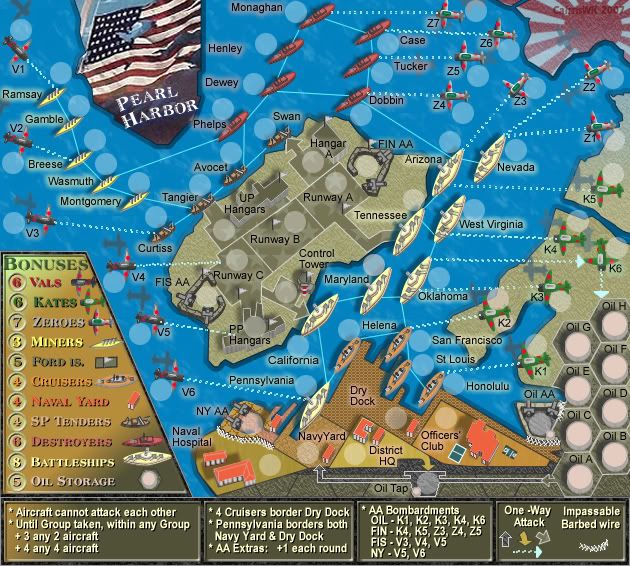

* Pearl Harbour * Waterloo * Forbidden City * Jamaica * Pot Mosbi
-

cairnswk
- Posts: 11510
- Joined: Sat Feb 03, 2007 8:32 pm
- Location: Australia


![]() by Bad Speler on Fri Aug 31, 2007 12:03 pm
by Bad Speler on Fri Aug 31, 2007 12:03 pm
Legend looks good try shrinking the work bonuses a bit so the text doesnt touch the edge of the legend
Highest Score: 2532
Highest Position: 69 (a long time ago)
Highest Position: 69 (a long time ago)
-

Bad Speler
- Posts: 1027
- Joined: Fri Jun 02, 2006 8:16 pm
- Location: Ottawa


![]() by cairnswk on Fri Aug 31, 2007 12:06 pm
by cairnswk on Fri Aug 31, 2007 12:06 pm
Bad Speler wrote:Legend looks good try shrinking the work bonuses a bit so the text doesnt touch the edge of the legend
Thanks Bad Speler...yes I have just done that on the next version.
* Pearl Harbour * Waterloo * Forbidden City * Jamaica * Pot Mosbi
-
cairnswk
- Posts: 11510
- Joined: Sat Feb 03, 2007 8:32 pm
- Location: Australia
![]() by cairnswk on Fri Aug 31, 2007 3:53 pm
by cairnswk on Fri Aug 31, 2007 3:53 pm
Wisse wrote:the text in the legend should all start on the same line (bonuses)
Wisse...i hate to be a pain, but if you are going to post in my threads, please give me a full explanation of what you are saying so i can fix it. I do not necessarily see the same things as you do...not instantly.
Only giving me half of the clues is simply not good enough.
Please explain further WHAT you are referring to above.
* Pearl Harbour * Waterloo * Forbidden City * Jamaica * Pot Mosbi
-
cairnswk
- Posts: 11510
- Joined: Sat Feb 03, 2007 8:32 pm
- Location: Australia
![]() by Wisse on Fri Aug 31, 2007 4:04 pm
by Wisse on Fri Aug 31, 2007 4:04 pm
ok i'll explain it with a picture: (sorry for not saying it well, but i tried my best  )
)

look at the white line then at the space between the white line and the text, it is all different (also the bonus numbers are that way)
look at the white line then at the space between the white line and the text, it is all different (also the bonus numbers are that way)


-

Wisse
- Posts: 4448
- Joined: Fri Oct 13, 2006 2:59 pm
- Location: The netherlands, gelderland, epe


![]() by Wisse on Fri Aug 31, 2007 4:10 pm
by Wisse on Fri Aug 31, 2007 4:10 pm
gimil wrote:Wisse you always pick out the littlest of details lol
its that detail that makes it perfect
oh and i see all those things without zooming in
and someone has to do it
-
Wisse
- Posts: 4448
- Joined: Fri Oct 13, 2006 2:59 pm
- Location: The netherlands, gelderland, epe
![]() by cairnswk on Fri Aug 31, 2007 4:14 pm
by cairnswk on Fri Aug 31, 2007 4:14 pm
Wisse wrote:gimil wrote:Wisse you always pick out the littlest of details lol
its that detail that makes it perfect
oh and i see all those things without zooming ini just zoom in for the explaining.
and someone has to do it
OK...thanks Wisse.....i understand now. Thank you
* Pearl Harbour * Waterloo * Forbidden City * Jamaica * Pot Mosbi
-
cairnswk
- Posts: 11510
- Joined: Sat Feb 03, 2007 8:32 pm
- Location: Australia
v41 Update
![]() by cairnswk on Fri Aug 31, 2007 4:34 pm
by cairnswk on Fri Aug 31, 2007 4:34 pm
Wisse wrote:the text in the legend should all start on the same line (bonuses)
Wisse...i beleive this fixes the in-line issue...
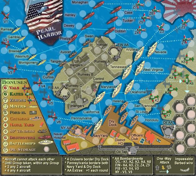
* Pearl Harbour * Waterloo * Forbidden City * Jamaica * Pot Mosbi
-
cairnswk
- Posts: 11510
- Joined: Sat Feb 03, 2007 8:32 pm
- Location: Australia
![]() by KEYOGI on Fri Aug 31, 2007 4:55 pm
by KEYOGI on Fri Aug 31, 2007 4:55 pm
The new legend looks great. It's now easy to read and pretty. 
One last little thing that's bugging me is the shadows for the Naval Hosptial buildings. The way the bigger building is casting a shadow beyond the small building, but not affecting it. It just stands out to me and I see one of two solutions. Perhaps reduce the distance of the shadows there or add some shading to the side of the smaller building.
Maybe I'm just being anal.
-
KEYOGI
- Posts: 1632
- Joined: Tue Oct 10, 2006 6:09 am

![]() by unriggable on Fri Aug 31, 2007 4:57 pm
by unriggable on Fri Aug 31, 2007 4:57 pm
Any chance we can call it WW2 Pearl Harbor so it can all fit under the WW2 category?

-

unriggable
- Posts: 8037
- Joined: Thu Feb 08, 2007 9:49 pm

![]() by cairnswk on Fri Aug 31, 2007 5:24 pm
by cairnswk on Fri Aug 31, 2007 5:24 pm
KEYOGI wrote:The new legend looks great. It's now easy to read and pretty.
One last little thing that's bugging me is the shadows for the Naval Hosptial buildings. The way the bigger building is casting a shadow beyond the small building, but not affecting it. It just stands out to me and I see one of two solutions. Perhaps reduce the distance of the shadows there or add some shading to the side of the smaller building.
Maybe I'm just being anal.
thanks Keyogi....i'll check this shadow issue and post in new version shortly.
unriggable wrote:
Any chance we can call it WW2 Pearl Harbor so it can all fit under the WW2 category?
unriggable...that would be a good idea!
* Pearl Harbour * Waterloo * Forbidden City * Jamaica * Pot Mosbi
-
cairnswk
- Posts: 11510
- Joined: Sat Feb 03, 2007 8:32 pm
- Location: Australia
![]() by Wisse on Sat Sep 01, 2007 12:58 am
by Wisse on Sat Sep 01, 2007 12:58 am
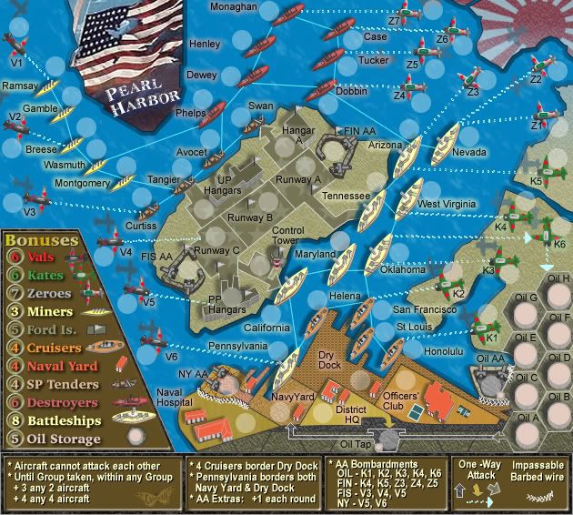
great it looks much better now,
only zeroes and vals are not on the right place, zeroes must go one pixel left and vals one right
also it seeems vals and kates look a bit blury or is it just the font?
only zeroes and vals are not on the right place, zeroes must go one pixel left and vals one right
also it seeems vals and kates look a bit blury or is it just the font?
-
Wisse
- Posts: 4448
- Joined: Fri Oct 13, 2006 2:59 pm
- Location: The netherlands, gelderland, epe
![]() by cairnswk on Sat Sep 01, 2007 4:39 pm
by cairnswk on Sat Sep 01, 2007 4:39 pm
fixed in next version wisse.Wisse wrote:great it looks much better now,
only zeroes and vals are not on the right place, zeroes must go one pixel left and vals one right
yes unfortunately there is a small trade-off with the font, i have used it as it is the same font in the title.also it seeems vals and kates look a bit blury or is it just the font?
Keyogi....the shadows have been fixed.
* Pearl Harbour * Waterloo * Forbidden City * Jamaica * Pot Mosbi
-
cairnswk
- Posts: 11510
- Joined: Sat Feb 03, 2007 8:32 pm
- Location: Australia
![]() by AndyDufresne on Sat Sep 01, 2007 4:44 pm
by AndyDufresne on Sat Sep 01, 2007 4:44 pm
Perhaps regarding the 'blurriness' of some of the legend text...would a black outline around the text bring it out more? Or would it just make it ugly? I'm not sure.
Also it would be nice to bring out the legend numbers slightly more, perhaps with a background color alteration...but hm...
--Andy
Also it would be nice to bring out the legend numbers slightly more, perhaps with a background color alteration...but hm...
--Andy
-
AndyDufresne
- Posts: 24935
- Joined: Fri Mar 03, 2006 8:22 pm
- Location: A Banana Palm in Zihuatanejo
![]() by cairnswk on Sat Sep 01, 2007 4:52 pm
by cairnswk on Sat Sep 01, 2007 4:52 pm
AndyDufresne wrote:Perhaps regarding the 'blurriness' of some of the legend text...would a black outline around the text bring it out more? Or would it just make it ugly? I'm not sure.
Also it would be nice to bring out the legend numbers slightly more, perhaps with a background color alteration...but hm...
--Andy
Andy...I think this is the font...i have tried several things like embossing...doubling the text size, drop shadows with the capabilities of my software, and unfortunately this is the font at this size. It works well in the title as that is sized to 22px but in the legend it is only 12px.
I guess i'll have to find another font for it.
* Pearl Harbour * Waterloo * Forbidden City * Jamaica * Pot Mosbi
-
cairnswk
- Posts: 11510
- Joined: Sat Feb 03, 2007 8:32 pm
- Location: Australia
V42 Legend Colour Change
![]() by cairnswk on Sat Sep 01, 2007 5:55 pm
by cairnswk on Sat Sep 01, 2007 5:55 pm
OK...i think this will solve the font and blurriness issues once and for all.
* There is a new font in the legend called Charter BT.
* This has been back by a drop shadow.
* and the background across the whole legend has been "cooked - caramelised"
Hope you like this one!!
* There is a new font in the legend called Charter BT.
* This has been back by a drop shadow.
* and the background across the whole legend has been "cooked - caramelised"
Hope you like this one!!
* Pearl Harbour * Waterloo * Forbidden City * Jamaica * Pot Mosbi
-
cairnswk
- Posts: 11510
- Joined: Sat Feb 03, 2007 8:32 pm
- Location: Australia
![]() by cairnswk on Sat Sep 01, 2007 5:58 pm
by cairnswk on Sat Sep 01, 2007 5:58 pm
gimil wrote:vals is a little to strong. apparetn form that im satisfied all round
thanks gimil...i can tone that down next post.
* Pearl Harbour * Waterloo * Forbidden City * Jamaica * Pot Mosbi
-
cairnswk
- Posts: 11510
- Joined: Sat Feb 03, 2007 8:32 pm
- Location: Australia
![]() by AndyDufresne on Sat Sep 01, 2007 7:06 pm
by AndyDufresne on Sat Sep 01, 2007 7:06 pm
Looking nicely enhanced now, cairnswk.
I noticed your signature on this map isn't that of the butterfly (or moth... I'm not sure which). Any particular reason? Just curious.
--Andy
I noticed your signature on this map isn't that of the butterfly (or moth... I'm not sure which
--Andy
-
AndyDufresne
- Posts: 24935
- Joined: Fri Mar 03, 2006 8:22 pm
- Location: A Banana Palm in Zihuatanejo
![]() by cairnswk on Sat Sep 01, 2007 8:41 pm
by cairnswk on Sat Sep 01, 2007 8:41 pm
AndyDufresne wrote:Looking nicely enhanced now, cairnswk.
I noticed your signature on this map isn't that of the butterfly (or moth... I'm not sure which
--Andy
The insect, Andy, is known as a Cairns bird-winged butterfly, very prolific colours from the northern tropics here (as in my avatar). I'll see if I can fit the signature somewhere.
* Pearl Harbour * Waterloo * Forbidden City * Jamaica * Pot Mosbi
-
cairnswk
- Posts: 11510
- Joined: Sat Feb 03, 2007 8:32 pm
- Location: Australia
Who is online
Users browsing this forum: No registered users
|
|||||||
| Conquer Club is not associated with RISK online in any way. Copyright © 2006-2025 by Big Wham LLC | |||||||