Conquer Club

Darts!!

Have an idea for a map? Discuss ideas and concepts here.

Moderator: Cartographers

Forum rules
Please read the Community Guidelines before posting.

Do you like the idea of this map?

 
Total votes : 0

Postby sully800 on Tue Aug 15, 2006 6:08 pm

Okay I added a poll, so voice your opinion about the map concept.

The newest update can be seen here... Image

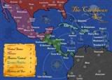
-I added army shadows just to show how they fit. Some of the rings are mostly taken over by the shadow but I expected that.
-I got rid of the inner/outer bull and created just a bullseye ring divided in a pie shape so it has 4 borders now.
-I changed the legend in the upper right to make it more legible (at least I think so)
-Fixed the problems mentioned with the yellow triangle and added that each continent has 4 countries.

Oh, I have decided to not allow diagonal attacks because I think it would make the continents too hard to hold. Should this be stated explicitly with another bullet or can it be assumed that people will figure that out. Obviously we don't want to have to spell out every instruction because it will clutter the side of the map too much. But I don't want to leave ambiguity which creates problems of what countries border each other (like in the Europe map).

Any opinions are still welcome, and more advice is of course needed. Still waiting for Andy to poke his head into this thread!
User avatar
Major sully800
 
Posts: 4978
Joined: Wed Jun 14, 2006 5:45 pm
Location: Bethlehem, Pennsylvania

Postby zarvinny on Tue Aug 15, 2006 6:37 pm

i kinda liked it more when you had the green 25 (semi bullzeye thingy) divided into 3, and then the bullzeye be a territory in itself....


but that is just me :)


I would like you to continue this brave venture, and I can't wait til I play this map..


AND WHO KNOWS... IT MIGHT ACTUALLY BE ... good?
User avatar
Lieutenant zarvinny
 
Posts: 249
Joined: Mon May 15, 2006 7:56 pm
Location: Kamchatka

Postby maritovw on Tue Aug 15, 2006 11:39 pm

about the army shadows.... i think it would be better without them, you could have the two versions (with and without shadows) and test them when you get to xml, if numbers are easily read without shadows, leave them out....

about the bullseye bonus here are a couple of ideas:
- don't give it a bonus, instead, make it add +1 for each continet held (or for every two continents...
- don't make it a continent, instead, make each slice add +1 only to the continents it borders (or only to the continents it doesn't border...)
User avatar
Sergeant 1st Class maritovw
 
Posts: 195
Joined: Mon Jul 17, 2006 10:05 pm
Location: Guatemala

Postby gavin_sidhu on Wed Aug 16, 2006 12:24 am

You could do a better job with the army shadows. I mean look at continent 3, the circles should be exactly centred but theyre not.

Try merging the two diagram pictures in the key (It would make it much easier, showing the four countries in the continent)
Highest Score: 1843 Ranking (Australians): 3
User avatar
Lieutenant gavin_sidhu
 
Posts: 1428
Joined: Mon May 22, 2006 6:16 am
Location: Brisbane, Australia

Postby Marvaddin on Wed Aug 16, 2006 9:42 am

sully800 wrote:I really do respect you as a poster and a player but you seem to be afraid of maps that are different than the norm.

:lol: Haha! Im afraid? No way. No many players plays almost all maps as I do. In fact, I dont like the classic map that much. However, to me this idea has no appeal (if not a negative appeal), and the playability will simply be the worst until now. But ok, if there are people wanting to play, finish it. Lets see how mnay games each of these people will play in this map... of course, as reverend said, even the crossword has some fans among our 3000 players, so this will possibly have too.
Image
User avatar
Major Marvaddin
 
Posts: 2545
Joined: Thu Feb 09, 2006 5:06 pm
Location: Belo Horizonte, Brazil

Postby sully800 on Wed Aug 16, 2006 5:59 pm

gavin_sidhu wrote:You could do a better job with the army shadows. I mean look at continent 3, the circles should be exactly centred but theyre not.

Try merging the two diagram pictures in the key (It would make it much easier, showing the four countries in the continent)


Yes, I need to center the army shadows better. I put them on rather haphazardly for the time but I will fix it later.

maritovw wrote:about the army shadows.... i think it would be better without them, you could have the two versions (with and without shadows) and test them when you get to xml, if numbers are easily read without shadows, leave them out....


Since there are green and red backgrounds on the map I think it would be impossible to see the green and red armies without the shadows. I agree it makes the map a little uglier, but I will play around with the opacity a bit once I put numbers on to make them have the least impact possible.

maritovw wrote:about the bullseye bonus here are a couple of ideas:
- don't give it a bonus, instead, make it add +1 for each continet held (or for every two continents...
- don't make it a continent, instead, make each slice add +1 only to the continents it borders (or only to the continents it doesn't border...)


I don't really like the idea of the bullseye adding a bonus to other continents because holding the bullseye already puts on in a powerful position. I think if your suggestion was implemented it would tip the power very quickly (perhaps in one turn) to the player who controls the bullseye and would cause too quick of an ending in no card/flat rate games. If everyone disagrees I can reconsider but right now I think the bullseye shoudl either have no bonus at all (not be a continent) or have a small bonus of 2-4.
Last edited by sully800 on Tue Aug 29, 2006 4:09 pm, edited 1 time in total.
User avatar
Major sully800
 
Posts: 4978
Joined: Wed Jun 14, 2006 5:45 pm
Location: Bethlehem, Pennsylvania

Postby reverend_kyle on Wed Aug 16, 2006 6:03 pm

Make the bullseye worth 10 armies... that will make it coveted and will lead to some interesting battles.
User avatar
Sergeant reverend_kyle
 
Posts: 9250
Joined: Tue Mar 21, 2006 4:08 pm
Location: 1000 post club

Postby sully800 on Wed Aug 16, 2006 6:03 pm

Marvaddin wrote:
sully800 wrote:I really do respect you as a poster and a player but you seem to be afraid of maps that are different than the norm.

:lol: Haha! Im afraid? No way. No many players plays almost all maps as I do. In fact, I dont like the classic map that much. However, to me this idea has no appeal (if not a negative appeal), and the playability will simply be the worst until now. But ok, if there are people wanting to play, finish it. Lets see how mnay games each of these people will play in this map... of course, as reverend said, even the crossword has some fans among our 3000 players, so this will possibly have too.


Point taken, but since I have several people enthusiastically telling me they want to play this map, I think it will be worth it. The biggest thing I think this site is currently missing is a very large map (in terms of having a lot of countries) and I know a few people would like that option as well. It may not be a map you enjoy which is understandable because you can't please everyone. However if some people like to play it a lot I think it will be well worth it (and I think this will be better, or at least simpler than the crossword map...and different enough that people will play it just to change things up).
User avatar
Major sully800
 
Posts: 4978
Joined: Wed Jun 14, 2006 5:45 pm
Location: Bethlehem, Pennsylvania

Postby reverend_kyle on Wed Aug 16, 2006 6:10 pm

sully800 wrote:
Marvaddin wrote:
sully800 wrote:I really do respect you as a poster and a player but you seem to be afraid of maps that are different than the norm.

:lol: Haha! Im afraid? No way. No many players plays almost all maps as I do. In fact, I dont like the classic map that much. However, to me this idea has no appeal (if not a negative appeal), and the playability will simply be the worst until now. But ok, if there are people wanting to play, finish it. Lets see how mnay games each of these people will play in this map... of course, as reverend said, even the crossword has some fans among our 3000 players, so this will possibly have too.


Point taken, but since I have several people enthusiastically telling me they want to play this map, I think it will be worth it. The biggest thing I think this site is currently missing is a very large map (in terms of having a lot of countries) and I know a few people would like that option as well. It may not be a map you enjoy which is understandable because you can't please everyone. However if some people like to play it a lot I think it will be well worth it (and I think this will be better, or at least simpler than the crossword map...and different enough that people will play it just to change things up).


It wont be simpler than the crossword map, the crossword map has very few rules.. yours has half the image of rules.
User avatar
Sergeant reverend_kyle
 
Posts: 9250
Joined: Tue Mar 21, 2006 4:08 pm
Location: 1000 post club

Postby rocksolid on Wed Aug 16, 2006 6:22 pm

sully800 wrote:I think a lot of people agree with me in that they want to play a map that is completely DIFFERENT. That is the goal.


Ding ding ding! 100 points.
User avatar
Lieutenant rocksolid
 
Posts: 625
Joined: Sat Mar 18, 2006 10:00 pm
Location: Mowwwnt Reeeal

Postby sully800 on Wed Aug 16, 2006 7:30 pm

reverend_kyle wrote:It wont be simpler than the crossword map, the crossword map has very few rules.. yours has half the image of rules.


Perhaps. I have never played the crossword map, but every time I look at it I find it confusing. The way the countries border each other and connect is just odd. Its very different (which I like) but I think the gameplay is not intuitive which is why more people don't play that map. In this, I think the countries are better defined which makes the playing style more intuitive (a better word for what I meant than "simpler")
User avatar
Major sully800
 
Posts: 4978
Joined: Wed Jun 14, 2006 5:45 pm
Location: Bethlehem, Pennsylvania

Postby sully800 on Sun Aug 20, 2006 10:30 pm

bumping to get more input.
User avatar
Major sully800
 
Posts: 4978
Joined: Wed Jun 14, 2006 5:45 pm
Location: Bethlehem, Pennsylvania

Postby N0g on Sun Aug 20, 2006 11:38 pm

Can we flip it over and play the Baseball game on the back? :D
User avatar
Lieutenant N0g
 
Posts: 73
Joined: Thu Mar 02, 2006 2:56 pm
Location: A van, down by the river

Postby zarvinny on Mon Aug 28, 2006 8:01 pm

B ump
U p
M y (sully's)
P ost
User avatar
Lieutenant zarvinny
 
Posts: 249
Joined: Mon May 15, 2006 7:56 pm
Location: Kamchatka

Postby cowshrptrn on Mon Aug 28, 2006 8:25 pm

you know, u dont' have to post those tumbnails. The very bottom link is the direct link to the image

It looks like a really really cool map. It really makes card useless in the beginning tho, cus u'll have tons of bonuses fomr the many tiny continents u controll (its almost like a make ur own continent!!). I cna't wait for this to come out. Try stylizing the background so its not plain white
Image
User avatar
Private cowshrptrn
 
Posts: 838
Joined: Thu Aug 17, 2006 1:15 pm
Location: wouldn't YOU like to know....

Postby cowshrptrn on Mon Aug 28, 2006 8:28 pm

I think he need army shadows. The green and red on his board are very similar to the green and red of the numbers.
Image
User avatar
Private cowshrptrn
 
Posts: 838
Joined: Thu Aug 17, 2006 1:15 pm
Location: wouldn't YOU like to know....

Postby sully800 on Mon Aug 28, 2006 11:11 pm

cowshrptrn wrote:you know, u dont' have to post those tumbnails. The very bottom link is the direct link to the image

It looks like a really really cool map. It really makes card useless in the beginning tho, cus u'll have tons of bonuses fomr the many tiny continents u controll (its almost like a make ur own continent!!). I cna't wait for this to come out. Try stylizing the background so its not plain white


In 3 or 4 player games you might start with a couple of continents which will be interesting I think. In a 6 player game it still might take a round or 2 to gain and hold any number of continents. It's tough to say what the bonus should be since the continents are so easy to capture and so hard to hold- but there are so many that people won't try and break a continent as soon as you get it, which will be an interesting change.

And yeah, I think I already said this but the army shadows are pretty necessary based on the colors of the board. I think they make the map look a bit worse (who's dart board is covered in white circles??) but to play the map it is needed.
User avatar
Major sully800
 
Posts: 4978
Joined: Wed Jun 14, 2006 5:45 pm
Location: Bethlehem, Pennsylvania

Postby sully800 on Tue Aug 29, 2006 4:25 pm

I decided to post this update as the actual image but I'm only going to do that for the newest version. The thumbnails save bandwidth for image shack and I would like to keep their service free because its useful.

Image

I centered all the army shadows so they look pretty good.

I also combined the two keys into one as suggested. What does everyone think about the inclusion of the black lines seperating each continent in the key? I don't know whether to keep them or not, so let me know what you think.
Last edited by sully800 on Thu Aug 31, 2006 10:20 pm, edited 2 times in total.
User avatar
Major sully800
 
Posts: 4978
Joined: Wed Jun 14, 2006 5:45 pm
Location: Bethlehem, Pennsylvania

Postby gavin_sidhu on Wed Aug 30, 2006 2:27 am

make them (the continent borders in the minimap) white like in the real map
Highest Score: 1843 Ranking (Australians): 3
User avatar
Lieutenant gavin_sidhu
 
Posts: 1428
Joined: Mon May 22, 2006 6:16 am
Location: Brisbane, Australia

Postby sully800 on Wed Aug 30, 2006 12:24 pm

Good call. I don't know why I didn't change it to that in the first place.
User avatar
Major sully800
 
Posts: 4978
Joined: Wed Jun 14, 2006 5:45 pm
Location: Bethlehem, Pennsylvania

Postby sully800 on Wed Aug 30, 2006 12:48 pm

Image

I changed the lines in the minimap to white, and added some lines to show the 4 different countries as well in case there was still confusion with that.

I also fixed a minor detail with the dart images around the title. The one fin was not completely connected to the body of the dart. Not sure if anyone would have noticed but its fixed anyway.
Last edited by sully800 on Thu Aug 31, 2006 10:18 pm, edited 1 time in total.
User avatar
Major sully800
 
Posts: 4978
Joined: Wed Jun 14, 2006 5:45 pm
Location: Bethlehem, Pennsylvania

Postby nascarfan38124 on Thu Aug 31, 2006 7:56 pm

i just want to say i like how the map is progressing and would like to play it when it comes out

there has been a suggestion to change the background of the map from plain white i suggest changing it to somethind like a wood background

also make the title (where it says Darts) a piece of paper with it written on it and have the darts around it look as if it is holding up the paper (pin it to the wood)

and for my last suggestion make the writting on the side look like it is on a chalkboard (i will post a pic. in another post) that records the score and maybe (but i dont think so) you can make the writhing in chalk form

you are doing a great job and i cant wait to play it
User avatar
Lieutenant nascarfan38124
 
Posts: 305
Joined: Tue Jun 27, 2006 9:20 pm
Location: SoCal

Postby nascarfan38124 on Thu Aug 31, 2006 8:11 pm

here are some examples

Image

Image
User avatar
Lieutenant nascarfan38124
 
Posts: 305
Joined: Tue Jun 27, 2006 9:20 pm
Location: SoCal

Postby sully800 on Thu Aug 31, 2006 9:14 pm

Yeah thats a good idea for the background. I was trying to make it look like it was hanging on the wall in a lounge or something...I experimented with a few different pictures of lounges or rooms but you could see so little of the background that they didn't look very good (I couldn't tell what it was supposed to be).

I'll try the stuff you proposed though...
User avatar
Major sully800
 
Posts: 4978
Joined: Wed Jun 14, 2006 5:45 pm
Location: Bethlehem, Pennsylvania

Postby sully800 on Thu Aug 31, 2006 10:16 pm

Okay lots of obvious updates...

Image

I added the wood background and a chalkboard for the font. Also a piece of paper as a background for the title which I think was a really good idea. I lightened up the green and blue in the key to make the font a little more legible. I also had to fiddle around with a lot of the lines in the map itself...so if you see any blocks of color that look shifted or any lines that aren't properly connected let me know. I fixed what I could see but I might have missed some.

I used Jota's CCU map as inspiration on how to make the chalkboard. I think it looks pretty decent like that.
User avatar
Major sully800
 
Posts: 4978
Joined: Wed Jun 14, 2006 5:45 pm
Location: Bethlehem, Pennsylvania

PreviousNext

Return to Melting Pot: Map Ideas

Who is online

Users browsing this forum: No registered users