the most painful 15mins of my life.

Moderator: Cartographers
![]() by yeti_c on Thu Dec 06, 2007 5:25 pm
by yeti_c on Thu Dec 06, 2007 5:25 pm


![]() by reverend_kyle on Thu Dec 06, 2007 8:42 pm
by reverend_kyle on Thu Dec 06, 2007 8:42 pm


![]() by gimil on Thu Dec 06, 2007 9:39 pm
by gimil on Thu Dec 06, 2007 9:39 pm
reverend_kyle wrote:I think this map needs more (insert hardest thing to do with a flattened image). Anyone else agree?
natty_dread wrote:I was wrong


![]() by edbeard on Thu Dec 06, 2007 11:12 pm
by edbeard on Thu Dec 06, 2007 11:12 pm


![]() by reverend_kyle on Fri Dec 07, 2007 2:51 am
by reverend_kyle on Fri Dec 07, 2007 2:51 am
![]() by gimil on Fri Dec 07, 2007 9:53 am
by gimil on Fri Dec 07, 2007 9:53 am
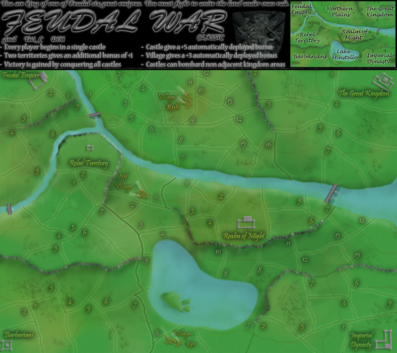
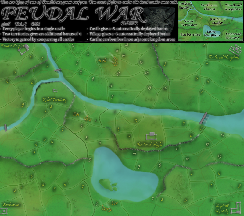
edbeard wrote:So, are you reasoning that because both of the Northern Kingdoms are somewhat spread out from the other four that it doesn't matter that they are further from the village?
They are 6 territories away, while the others are four away.
I know you've discussed all this, but if you don't mind maybe explain your thoughts behind the bonuses and layout etc..
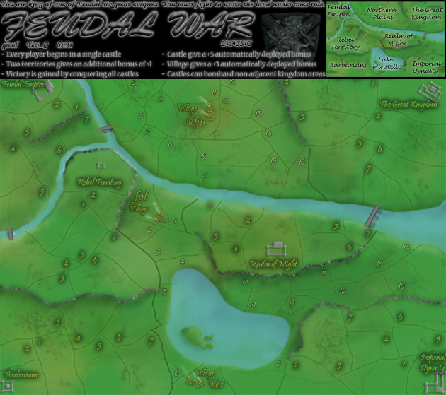
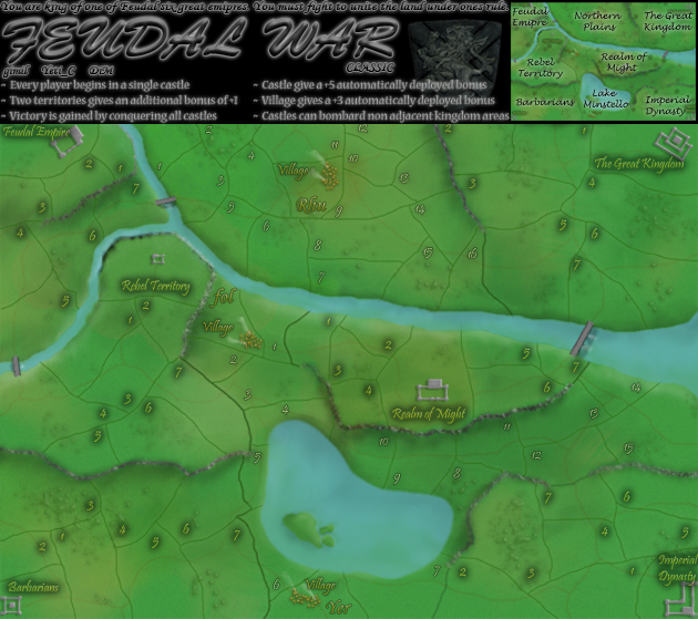
Also, do you think 'conquering' needs to be explained? Hold all castles until the beginning of your next turn. There would be space for this if you removed the one line of text above the title.
natty_dread wrote:I was wrong
![]() by gimil on Fri Dec 07, 2007 11:17 am
by gimil on Fri Dec 07, 2007 11:17 am
reverend_kyle wrote:As a serious suggestion, I don't much like the title. The font bothers me. I also like colorful maps, but that is obv not the style you are going for.
natty_dread wrote:I was wrong
![]() by zach on Sat Dec 08, 2007 9:20 am
by zach on Sat Dec 08, 2007 9:20 am
gimil wrote:reverend_kyle wrote:As a serious suggestion, I don't much like the title. The font bothers me. I also like colorful maps, but that is obv not the style you are going for.
KYLE stop with the vage suggestions, i need to know what you dont like about the title, the color? the font? I can fix it if you dont tell me whats wrong with it.
![]() by rebelman on Sat Dec 08, 2007 1:21 pm
by rebelman on Sat Dec 08, 2007 1:21 pm


![]() by Kaplowitz on Sat Dec 08, 2007 1:28 pm
by Kaplowitz on Sat Dec 08, 2007 1:28 pm


![]() by mibi on Sat Dec 08, 2007 2:38 pm
by mibi on Sat Dec 08, 2007 2:38 pm
Keredrex wrote:I agree The font on the territs is fine but the title just doesn't look right.....The legend is better although A non serif font would probably be better.


![]() by rebelman on Mon Dec 10, 2007 10:27 am
by rebelman on Mon Dec 10, 2007 10:27 am
![]() by Keredrex on Mon Dec 10, 2007 12:15 pm
by Keredrex on Mon Dec 10, 2007 12:15 pm
mibi wrote:Keredrex wrote:I agree The font on the territs is fine but the title just doesn't look right.....The legend is better although A non serif font would probably be better.
bah... the more serifs the better...


![]() by gimil on Mon Dec 10, 2007 1:26 pm
by gimil on Mon Dec 10, 2007 1:26 pm
rebelman wrote:lose the "village" part of the "village names"
================================
after seeing what wm did in conquerclub man im in an animation mood could you put some animation in the water (i think i saw tel do this earlier in this thread) and also the smoke in the villages would look class animated
=================================
have a few issues with the text in the legend, will post on this anon once I have a proposed solution.
natty_dread wrote:I was wrong
![]() by gimil on Tue Dec 11, 2007 1:03 pm
by gimil on Tue Dec 11, 2007 1:03 pm
natty_dread wrote:I was wrong
![]() by AndyDufresne on Tue Dec 11, 2007 11:29 pm
by AndyDufresne on Tue Dec 11, 2007 11:29 pm


Users browsing this forum: No registered users
|
|||||||
| Conquer Club is not associated with RISK online in any way. Copyright © 2006-2025 by Big Wham LLC | |||||||