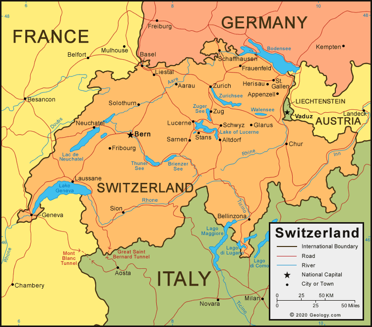
the graphics are pretty good
does there have to be such a small gap in the mountains between Brig and Bern? Brig looks isolated from its continent even though I know its not. maybe open it up just a little more?
it looks almost as if Zug can't attack Schwyz. i think its because Zug's border is darker than the rest is, so it looks a bit more like an impassible. its not a big deal though.
is the background the alps? i like it.
are the borders outside the map the borders of other countries?
could the legend stand out a bit more? it blends in too much in my opinion.
thats all for now