[Abandoned] - Romania
Moderator: Cartographers
Re: Romania [I] - v12.1 - 1st post and pg9
![]() by whitestazn88 on Wed Sep 03, 2008 7:34 pm
by whitestazn88 on Wed Sep 03, 2008 7:34 pm
i still don't like how the names fit inside the territs...
-
 whitestazn88
- Posts: 3128
- Joined: Mon Feb 05, 2007 2:59 pm
- Location: behind you


Re: Romania [I] - v12.1 - 1st post and pg9
![]() by ZeakCytho on Wed Sep 03, 2008 7:50 pm
by ZeakCytho on Wed Sep 03, 2008 7:50 pm
It looks like part of the Danube Delta territory covers the Black Sea? I'd redraw the borders so they hug the coastline.
Could you take the continent names from the main map and put them on the minimap instead? I think they'd fit better and be more legible there.
Could you take the continent names from the main map and put them on the minimap instead? I think they'd fit better and be more legible there.
-

ZeakCytho
- Posts: 1251
- Joined: Wed Sep 12, 2007 4:36 pm


Re: Romania [I] - v12.1 - 1st post and pg9
![]() by foregone on Wed Sep 03, 2008 11:15 pm
by foregone on Wed Sep 03, 2008 11:15 pm
whitestazn88 wrote:i still don't like how the names fit inside the territs...
Any particular ones?
ZeakCytho wrote:It looks like part of the Danube Delta territory covers the Black Sea? I'd redraw the borders so they hug the coastline.
Not sure what you mean there, sorry. There isn't any space between the border and the territory there at the mo?
ZeakCytho wrote:Could you take the continent names from the main map and put them on the minimap instead? I think they'd fit better and be more legible there.
I had it like this before (v8.5, pg5) but how it is currently was preferred. Take a look and tell me if you prefer the old way and I can maybe try that again. One of the problems is the length of the names of the continents as they stick out off the minimap as well.
-

foregone
- Posts: 289
- Joined: Sun May 11, 2008 1:00 am
- Location: Sydney, NSW, Australia


Re: Romania [I] - v12.1 - 1st post and pg9
![]() by ZeakCytho on Wed Sep 03, 2008 11:51 pm
by ZeakCytho on Wed Sep 03, 2008 11:51 pm
foregone wrote:ZeakCytho wrote:It looks like part of the Danube Delta territory covers the Black Sea? I'd redraw the borders so they hug the coastline.
Not sure what you mean there, sorry. There isn't any space between the border and the territory there at the mo?
My apologies. I thought part of the territory overlapped the Black Sea water, but after checking with a Google Maps satellite image, I see this is not the case. Ignore this comment.
foregone wrote:ZeakCytho wrote:Could you take the continent names from the main map and put them on the minimap instead? I think they'd fit better and be more legible there.
I had it like this before (v8.5, pg5) but how it is currently was preferred. Take a look and tell me if you prefer the old way and I can maybe try that again. One of the problems is the length of the names of the continents as they stick out off the minimap as well.
I do think I prefer that style to the current one - if other people disagree, though, I guess keep it the way it is.
-
ZeakCytho
- Posts: 1251
- Joined: Wed Sep 12, 2007 4:36 pm
Re: Romania [I] - v12.1 - 1st post and pg9
![]() by foregone on Thu Sep 04, 2008 12:21 pm
by foregone on Thu Sep 04, 2008 12:21 pm
ZeakCytho wrote:foregone wrote:ZeakCytho wrote:It looks like part of the Danube Delta territory covers the Black Sea? I'd redraw the borders so they hug the coastline.
Not sure what you mean there, sorry. There isn't any space between the border and the territory there at the mo?
My apologies. I thought part of the territory overlapped the Black Sea water, but after checking with a Google Maps satellite image, I see this is not the case. Ignore this comment.
No worries, thanks for checking back on it.
ZeakCytho wrote:foregone wrote:ZeakCytho wrote:Could you take the continent names from the main map and put them on the minimap instead? I think they'd fit better and be more legible there.
I had it like this before (v8.5, pg5) but how it is currently was preferred. Take a look and tell me if you prefer the old way and I can maybe try that again. One of the problems is the length of the names of the continents as they stick out off the minimap as well.
I do think I prefer that style to the current one - if other people disagree, though, I guess keep it the way it is.
Will play with it and put up two versions, probably tomorrow some time. Then it can be compared etc.
-
foregone
- Posts: 289
- Joined: Sun May 11, 2008 1:00 am
- Location: Sydney, NSW, Australia
Re: Romania [I] - v12.1 - 1st post and pg9
![]() by foregone on Fri Sep 05, 2008 1:00 am
by foregone on Fri Sep 05, 2008 1:00 am
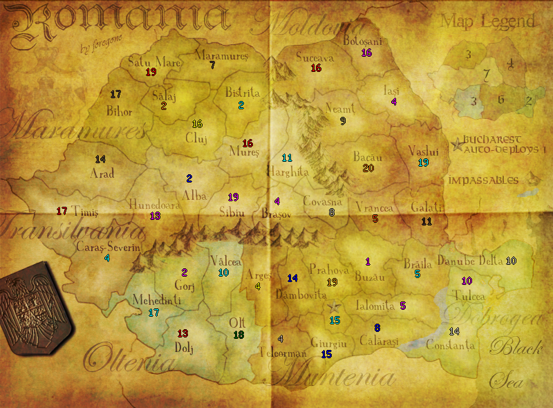
The continent names as they are now:
Continent names on the minimap again (diff front from 8.5 though):
http://img98.imageshack.us/img98/8/romaniaupdate12minimapcfg6.png
Pg5, 8.5, has minimap continent names with another font if anybody wants to check that.
Which is preferrable? My personal preference is the way it is currently, on the main map. But I have no qualms on changing it if thats how people feel.
- Click image to enlarge.

Continent names on the minimap again (diff front from 8.5 though):
http://img98.imageshack.us/img98/8/romaniaupdate12minimapcfg6.png
Pg5, 8.5, has minimap continent names with another font if anybody wants to check that.
Which is preferrable? My personal preference is the way it is currently, on the main map. But I have no qualms on changing it if thats how people feel.
Last edited by foregone on Sat Sep 06, 2008 12:31 am, edited 1 time in total.
-
foregone
- Posts: 289
- Joined: Sun May 11, 2008 1:00 am
- Location: Sydney, NSW, Australia
Re: Romania [I] - v12.1 - 1st post and pg9
![]() by Sven Hassel on Fri Sep 05, 2008 1:59 pm
by Sven Hassel on Fri Sep 05, 2008 1:59 pm
on the main map it looks better than in the minimap, but the way the way that the continents are named only on the map, and nop the minimap shouldn't be a problem, High Seas has the exact stile
"Bullets kill, grenades kill, bayonets kill, the cold kills. Death has a thousand faces. The worst of them all: the Court Martial."

-
Sven Hassel
- Posts: 163
- Joined: Thu Jul 26, 2007 3:15 pm
- Location: Romania, the land where anything can happen


Re: Romania [I] - v12.1 - 1st post and pg9
![]() by foregone on Sat Sep 06, 2008 12:32 am
by foregone on Sat Sep 06, 2008 12:32 am
Kewl, then I'll just revert to the continent names on the main map since that seems to be the general preference, and possibly mine as well. If people feel otherwise at a later stage I'll relook into it.
-
foregone
- Posts: 289
- Joined: Sun May 11, 2008 1:00 am
- Location: Sydney, NSW, Australia
Re: Romania [I] - v12.1 - 1st post and pg9
![]() by Ruben Cassar on Sat Sep 06, 2008 4:13 am
by Ruben Cassar on Sat Sep 06, 2008 4:13 am
Sorry to come in so late, but some of the central colours are a bit too similar to distinguish, Maybe you could try some different tones?
Also I think it should be Moldavia and not Moldovia. I would opt for Bucuresti and not Bucharest since all your other names are in Romanian.
Also I think it should be Moldavia and not Moldovia. I would opt for Bucuresti and not Bucharest since all your other names are in Romanian.


-

Ruben Cassar
- Posts: 2160
- Joined: Thu Nov 16, 2006 6:04 am
- Location: Civitas Invicta, Melita, Evropa


Re: Romania [I] - v12.1 - 1st post and pg9
![]() by foregone on Sat Sep 06, 2008 5:26 am
by foregone on Sat Sep 06, 2008 5:26 am
Ruben Cassar wrote:Also I think it should be Moldavia and not Moldovia.
As far as I can tell they're both used spellings. I switched to Moldovia as a suggested spelling by Sven above (who seems to actually be Romanian). While I have no particular issue on which spelling to use it seems the better choice right now. Same applies to the spelling of some of the other continents.
Ruben Cassar wrote:I would opt for Bucuresti and not Bucharest since all your other names are in Romanian.
My bad, should do that. Will change it on the next update.
Ruben Cassar wrote:Sorry to come in so late, but some of the central colours are a bit too similar to distinguish, Maybe you could try some different tones?
While I'm not jumping for joy, I can take a look at it
Is the trouble between the grey and brown or brown and maroon? The colours used are to ensure that it fits in with the map style, but I can try to change one of them if it helps (or two if necessary).
Thanks Ruben.
-
foregone
- Posts: 289
- Joined: Sun May 11, 2008 1:00 am
- Location: Sydney, NSW, Australia
Re: Romania [I] - v12.1 - 1st post and pg9
![]() by DiM on Sat Sep 06, 2008 6:32 am
by DiM on Sat Sep 06, 2008 6:32 am
first of all i love the look and feel of the map. congrats for that.
there are minor spelling issues that have probably been already covered. if not here they are:
Moldova instead of Moldovia
București instead of Bucharest
Maramureș instead of Maramures
Delta Dunării instead of Danube Delta
about the graphics i like the choice of colours and the parchment theme but i think you should go a bit further and add even more finesse details:
1. folding marks
2. curled corners
3. jagged margins (as if the map is so old it started tearing at the edges)
4. a darker appearance
here's a sample of what i mean (without curled corners and jagged edges cause i don't have time to do those right now)
“In the beginning God said, the four-dimensional divergence of an antisymmetric, second rank tensor equals zero, and there was light, and it was good. And on the seventh day he rested.”- Michio Kaku
-

DiM
- Posts: 10415
- Joined: Wed Feb 14, 2007 6:20 pm
- Location: making maps for scooby snacks


Re: Romania [I] - v12.1 - 1st post and pg9
![]() by foregone on Sun Sep 07, 2008 3:06 am
by foregone on Sun Sep 07, 2008 3:06 am
DiM wrote:first of all i love the look and feel of the map. congrats for that.
there are minor spelling issues that have probably been already covered. if not here they are:
Moldova instead of Moldovia
București instead of Bucharest
Maramureș instead of Maramures
Delta Dunării instead of Danube Delta
about the graphics i like the choice of colours and the parchment theme but i think you should go a bit further and add even more finesse details:
1. folding marks
2. curled corners
3. jagged margins (as if the map is so old it started tearing at the edges)
4. a darker appearance
here's a sample of what i mean (without curled corners and jagged edges cause i don't have time to do those right now)
Spelling - consider it done.
Graphics wise, I'm working on making it work right now. Seems easier for you than for me, heh. Struggling to find a nice creased paper image that has crisp folds, but this will happen eventually. Got something going for the margins/corners that should look nice. Will also darken it a bit. At the same time I definitely will have to play with the colour selection a bit, mainly because the darker the image the harder it is to differentiate between the faded colours. Will put up an update the moment I have these new skills in my belt.
-
foregone
- Posts: 289
- Joined: Sun May 11, 2008 1:00 am
- Location: Sydney, NSW, Australia
Re: Romania [I] - v12.1 - 1st post and pg9
![]() by yeti_c on Sun Sep 07, 2008 2:51 pm
by yeti_c on Sun Sep 07, 2008 2:51 pm
PS - just in case you didn't know - DiM is our resident Romanian. (He's been on a hiatus recently)
C.
C.

Highest score : 2297
-

yeti_c
- Posts: 9624
- Joined: Thu Jan 04, 2007 9:02 am


Re: Romania [I] - v13 - pg 1/10 Graphics Update
![]() by foregone on Mon Sep 08, 2008 6:04 pm
by foregone on Mon Sep 08, 2008 6:04 pm
Okie dokie.
With DiM's suggestion, and a tip here and there, I have updated the graphics to be more parchemnty cubed.
Updated: Grunged it up.
Edges and curls.
Darkened Muntenia (colourwise) to make it easier to distinguish the continents.
Folds across parchment.
Large Image:
Small Image:
With DiM's suggestion, and a tip here and there, I have updated the graphics to be more parchemnty cubed.
Updated: Grunged it up.
Edges and curls.
Darkened Muntenia (colourwise) to make it easier to distinguish the continents.
Folds across parchment.
Large Image:
- Click image to enlarge.

Small Image:
- Click image to enlarge.

-
foregone
- Posts: 289
- Joined: Sun May 11, 2008 1:00 am
- Location: Sydney, NSW, Australia
Re: Romania [I] - v13 - pg 1/10 Graphics Update
![]() by ZeakCytho on Mon Sep 08, 2008 6:23 pm
by ZeakCytho on Mon Sep 08, 2008 6:23 pm
Could you darken the entire map a shade? Or bump the contrast up. Not much, but a little.
Also, consider adding a drop shadow under the paper so it looks like it's sitting on top of the wood. This is especially needed around the curled up edges.
Also, consider adding a drop shadow under the paper so it looks like it's sitting on top of the wood. This is especially needed around the curled up edges.
-
ZeakCytho
- Posts: 1251
- Joined: Wed Sep 12, 2007 4:36 pm
Re: Romania [I] - v13 - pg 1/10 Graphics Update
![]() by oaktown on Mon Sep 08, 2008 10:26 pm
by oaktown on Mon Sep 08, 2008 10:26 pm
this is looking very nice foregone. I'm liking this map!
As you have probably figured out by now, I love antique maps so I love the old parchment style of the map, but it is possible to look too weathered - we still need to be able to make out borders and names or it will be frustrating to play. Right now my eyes are straining to make out the playable aspects of the map. Little stuff that i think would make play easier:

As you have probably figured out by now, I love antique maps so I love the old parchment style of the map, but it is possible to look too weathered - we still need to be able to make out borders and names or it will be frustrating to play. Right now my eyes are straining to make out the playable aspects of the map. Little stuff that i think would make play easier:
- The entire Dobrogea region seems to have been washed out to the point htat it no longer looks like playable area anymore; it gets lost in the legend and unplayable map border. And it's hard to tell what's going on with the borders of the terits in that region.
- Much of your text is looking a bit too faded, in my opinion. Especially in the small version it is tough to read the region names, legend text, and some territory names.
- Buzau's title seems like it would be better up higher - right now it seems to cross a border unnecessarily, and since Buzau seems to change color in the middle of the territory it's a bit muddled in through there. In fact, in general there are a lot of territory titles that can come off borders.
- The new border between Brasov and Buzau could use perhaps a bit less grunge to make it obvious - with the markings and stains in there, it could be missed.
-

oaktown
- Posts: 4451
- Joined: Sun Dec 03, 2006 9:24 pm
- Location: majorcommand


Re: Romania [I] - v13 - pg 1/10 Graphics Update
![]() by foregone on Mon Sep 08, 2008 11:08 pm
by foregone on Mon Sep 08, 2008 11:08 pm
ZeakCytho wrote:Could you darken the entire map a shade? Or bump the contrast up. Not much, but a little.
Also, consider adding a drop shadow under the paper so it looks like it's sitting on top of the wood. This is especially needed around the curled up edges.
Will be degrunging it a bit, will try to just darken it a shade then. Will also play with adding a drop shadow. in one or two spots.
oaktown wrote:this is looking very nice foregone. I'm liking this map!
As you have probably figured out by now, I love antique maps so I love the old parchment style of the map, but it is possible to look too weathered - we still need to be able to make out borders and names or it will be frustrating to play. Right now my eyes are straining to make out the playable aspects of the map. Little stuff that i think would make play easier:Other than where visuals interfere with playability, I don't have any concerns with the gameplay. Seems balanced and should be fun to play.
- The entire Dobrogea region seems to have been washed out to the point htat it no longer looks like playable area anymore; it gets lost in the legend and unplayable map border. And it's hard to tell what's going on with the borders of the terits in that region.
- Much of your text is looking a bit too faded, in my opinion. Especially in the small version it is tough to read the region names, legend text, and some territory names.
- Buzau's title seems like it would be better up higher - right now it seems to cross a border unnecessarily, and since Buzau seems to change color in the middle of the territory it's a bit muddled in through there. In fact, in general there are a lot of territory titles that can come off borders.
- The new border between Brasov and Buzau could use perhaps a bit less grunge to make it obvious - with the markings and stains in there, it could be missed.
So I will grunge it up a little less, which should solve alot of the fade issues (because of the way I did the grunge up) and hopefully that will make everything clearer again. I'll also move the names off of the territory borders where I can. One or two of them are difficult to do this, but where possible I shall make a concerted effort.
Thanks guys.
-
foregone
- Posts: 289
- Joined: Sun May 11, 2008 1:00 am
- Location: Sydney, NSW, Australia
Re: Romania [I] - v13 - pg 1/10 Graphics Update
![]() by Sven Hassel on Wed Sep 10, 2008 11:51 pm
by Sven Hassel on Wed Sep 10, 2008 11:51 pm
loving it  keep up the good work
"Bullets kill, grenades kill, bayonets kill, the cold kills. Death has a thousand faces. The worst of them all: the Court Martial."
-
Sven Hassel
- Posts: 163
- Joined: Thu Jul 26, 2007 3:15 pm
- Location: Romania, the land where anything can happen
Re: Romania [I] - v14 - pg 1/10 Graphics Update
![]() by foregone on Thu Sep 11, 2008 10:26 am
by foregone on Thu Sep 11, 2008 10:26 am
Updates:
Main question: Does it look old yet clear enough for gameplay?
Large Image:
Small Image:
- Mainly, I worked on the grunge factor. Did it a little differently to attempt to ensure that it doesn't muck with the clarity overly. The coloration is mildly different for the grunge layer and the amount of age "noise" is slightly less.
Moved territory names off borders. One or two of them still hit border, mainly to ensure space for army numbers on the small map.
Darkened the territory names and the inner borders on the small map, to make sure they are still clear on it.
Tried some drop shadows around the edge of the map but it didn't really look good in my opinion. I want it to look flatish on the table, rather than lifted off. Does anyone else feel strongly about the need for shadows?
Main question: Does it look old yet clear enough for gameplay?
Large Image:
- Click image to enlarge.

Small Image:
- Click image to enlarge.

-
foregone
- Posts: 289
- Joined: Sun May 11, 2008 1:00 am
- Location: Sydney, NSW, Australia
Re: Romania [I] - v14 - pg 1/10 Graphics Update
![]() by e_i_pi on Thu Sep 11, 2008 10:34 am
by e_i_pi on Thu Sep 11, 2008 10:34 am
foregone wrote:Updates:Mainly, I worked on the grunge factor. Did it a little differently to attempt to ensure that it doesn't muck with the clarity overly. The coloration is mildly different for the grunge layer and the amount of age "noise" is slightly less.
Moved territory names off borders. One or two of them still hit border, mainly to ensure space for army numbers on the small map.
Darkened the territory names and the inner borders on the small map, to make sure they are still clear on it.
Tried some drop shadows around the edge of the map but it didn't really look good in my opinion. I want it to look flatish on the table, rather than lifted off. Does anyone else feel strongly about the need for shadows?
Shadows would be nice if they looked nice, but I wouldn't consider them high priority. I think the curled edges of the map are too different a style to the rest. They're a very consistent gradient, and are far too saturated. Maybe bring the saturation down on them a little, and add some noise, 20-30% or so?
foregone wrote:Main question: Does it look old yet clear enough for gameplay?
Looks great, definitely aesthetically pleasing, and looks plenty clear enough for play. The shading, although all very similar, is still more clear than Middle East map (which is one of my fave maps). I'd be happy to play on it as it stands.
-

e_i_pi
- Posts: 1775
- Joined: Tue Feb 12, 2008 2:19 pm
- Location: Corruption Capital of the world


Re: Romania [I] - v14 - pg 1/10 Graphics Update
![]() by yeti_c on Thu Sep 11, 2008 10:39 am
by yeti_c on Thu Sep 11, 2008 10:39 am
If you look at DiM's version - the territory names & borders are really a lot darker - and I think that helps?!
C.
C.
Highest score : 2297
-
yeti_c
- Posts: 9624
- Joined: Thu Jan 04, 2007 9:02 am
Re: Romania [I] - v14 - pg 1/10 Graphics Update
![]() by gdeangel on Thu Sep 11, 2008 11:53 am
by gdeangel on Thu Sep 11, 2008 11:53 am
yeti_c wrote:If you look at DiM's version - the territory names & borders are really a lot darker - and I think that helps?!
C.
I concur ... and you really get the "map" effect with the crease and such with the darker colors.
-
gdeangel
- Posts: 779
- Joined: Mon Jan 14, 2008 11:48 pm
- Location: In the Basement


Re: Romania [I] - v14 - pg 1/10 Graphics Update
![]() by foregone on Thu Sep 11, 2008 4:05 pm
by foregone on Thu Sep 11, 2008 4:05 pm
This is the map darkened and saturated. Any better?
- Click image to enlarge.

-
foregone
- Posts: 289
- Joined: Sun May 11, 2008 1:00 am
- Location: Sydney, NSW, Australia
Re: Romania [I] - v14 - pg 1/10 Graphics Update
![]() by gdeangel on Thu Sep 11, 2008 5:33 pm
by gdeangel on Thu Sep 11, 2008 5:33 pm
The other one is more thematic - brighter and more yellow - but the one you just posted is easy enough to read... The only thing not jumping out to me is the star for Bucharest... maybe another color would work better there, like with more red in it? The rolled / rough edges are a nice touch.
BTW, I'm still unclear about that central mountain pass.
BTW, I'm still unclear about that central mountain pass.
Last edited by gdeangel on Thu Sep 11, 2008 5:35 pm, edited 1 time in total.
-
gdeangel
- Posts: 779
- Joined: Mon Jan 14, 2008 11:48 pm
- Location: In the Basement
Re: Romania [I] - v14 - pg 1/10 Graphics Update
![]() by ZeakCytho on Thu Sep 11, 2008 5:34 pm
by ZeakCytho on Thu Sep 11, 2008 5:34 pm
I think this version is too dark - but the old one was too light. Try something in between next?
-
ZeakCytho
- Posts: 1251
- Joined: Wed Sep 12, 2007 4:36 pm
Who is online
Users browsing this forum: No registered users
|
|||||||
| Conquer Club is not associated with RISK online in any way. Copyright © 2006-2025 by Big Wham LLC | |||||||