The Roman Empire *Page 11* [Vacation]
Moderator: Cartographers


![]() by RobinJ on Thu May 31, 2007 10:30 am
by RobinJ on Thu May 31, 2007 10:30 am
DiM wrote:Teya wrote:DiM wrote:for example this is how i envision this map.
Make your own version then.
i don't want to make my own version. i just posted what i would like it to be.
what's wrong with giving a suggestion?
It just doesn't fit with the map but it would be cool for another Roman map (*hint, hint, nudge, nudge*) - Ruben has been a tad harsh I think but he is still right.
nmhunate wrote:Speak English... It is the language that God wrote the bible in.
Highest Score: 2437
Highest Place: 84
-

 RobinJ
- Posts: 1901
- Joined: Mon Aug 21, 2006 1:56 pm
- Location: Northern Ireland


![]() by Guiscard on Thu May 31, 2007 12:37 pm
by Guiscard on Thu May 31, 2007 12:37 pm
DiM wrote:time for a more complex feedback post.
1. black borders are better
2. the image above dacia seems to be from rome-total war. i don't know if you need copyright for that but i'd take it out as it looks bad because the other neutral terit images are totally different (stone carvings)
3. the neutral terit background. lately everybody seems to be using images for them. while i think it's good i think i've personally reached a saturation point.
4. map size. i hope the map presented so far is the small version otherwise there will be severe problems with cluttering.
5. the colours are too bright for me.
6. i dont like the gradient fill for the terits.
7. the sea and the terits are in desperate need of a texture.
8. impassable borders.
9. the map also needs a gimmick. something to put a spark in gameplay.
overall the map gives me a bland feeling. i think so much more could be done to capture better the roman empire but unfortunately so far it's just like any other geographical map on the site.
1. I will address borders in another post.
2. It's not from any game. Its from a print of which I own a copy, but I found the image online so I figure its OK to use it.
3. Any reason other than you think everyone is doing it? I can't find a single quenched map with a similar thing other than USA. Can you? I'd prefer to stick with that rather than a blank boring space, and I think it helps to evoke the feeling of Roman glory (although it seems you think the map lacks that anyway).
4. No it is the large version. 800px. I don't think thee is any way around it really. Its a big map unfortunately. We'll have to see what its like when I sort out the small map and army numbers etc.
5.
6.
7. Are all perfectly good comments, by they are simple aesthetic choices with which I completely disagree. I really want to move away from the standard black border, colour with texture continents. I want this map to be something different.
8. What about them? Where are they needed? There's no point adding them if they aren't needed. No-ones really started considering gameplay properly yet other than my initial ideas over bonus cities and sea routes.
9. Gimmick? I'm afaid from what you've said I entirely disagree. No offence to your own maps and suchlike, but I come to this site to play Risk, not Age of Empires or Total War... I want a Risk map with random deployment where you roll your dice, get bonuses for continents and conquer your opponants. The simplicity is what attracts me to the game. No offence, but take your gimmicky gameplay elsewhere. I ant to make maps I'd be happy to play, and I strongly doubt I'll be playing your Merchants map because, whilst I'm sure it is fun and a really fun map to play, I'd rather play proper risk maps because that's what I enjoy.
qwert wrote:Can i ask you something?What is porpose for you to open these Political topic in ConquerClub? Why you mix politic with Risk? Why you not open topic like HOT AND SEXY,or something like that.
-

Guiscard
- Posts: 4103
- Joined: Fri Dec 08, 2006 7:27 pm
- Location: In the bar... With my head on the bar

![]() by Guiscard on Thu May 31, 2007 12:44 pm
by Guiscard on Thu May 31, 2007 12:44 pm
KEYOGI wrote:Don't tell me what I can and cannot post.
I have plenty of helpful and friendly suggestions on how to make maps look better in the foundry and are often completely ignored or the cartographer simply wishes not to make the change for their own personal reason.
What problems are there with the lighter coloured borders? Just because some people don't like them doesn't mean they are a problem. A poll, yes that's the answer to all our problems. I see little value in trivial polls about colours and such, they are much more appropriate for gameplay or more pressing issues.
Now lets keep any future discussion on topic and not drag down Guiscard's thread with off topic nonsense.
Thankyou Keyogi. This is basically what I wanted to say but I didn't want a petty argument developing over it.
I believe the borders are a simple 'either or' aesthetic choice which I, as the mapmaker, have the right to make. I am perfectly willing to compromise and tone down the glow, and I recognise Rubens comment about islands being deformed and I am looking at dealing with that next update... The white borders, however, are a pretty important stylistic choice for me, pretty crucial in the same way as the choice of actual geographical area or style (i.e. minimalistic? real-world overly like San Fran?)
Hopefully this will be the end of the matter.
Keyogi wrote:Is the three city bonus really necessary? It's just me, but I'd prefer if just Roma was the focal point. I'm no gameplay expert, but I think gameplay will be more interesting if it was just the one city bonus instead of the three. Also, how about moving the Hispania sea connection with Corsica-Sardinia to Taraconesis? I think it'll just look a bit neater there and wont really make any difference to gameplay.
Firstly, I don't mind overly going back to the single Roma bonus but I'd like to see what other people think about it. I do like the idea of Rome being the centre, but also of other key cities being important and linked, perhaps acting as the centre for 'rival' empires, as it were. It also takes away the certain element of a 'rush for the middle' where anyone starting with Britain would have no chance. One player lucky enough to start next to Rome could stack there and potentially have a massive advantage after a couple of turns, but the other cities could counter this slightly.
qwert wrote:Can i ask you something?What is porpose for you to open these Political topic in ConquerClub? Why you mix politic with Risk? Why you not open topic like HOT AND SEXY,or something like that.
-
Guiscard
- Posts: 4103
- Joined: Fri Dec 08, 2006 7:27 pm
- Location: In the bar... With my head on the bar
![]() by DiM on Thu May 31, 2007 12:57 pm
by DiM on Thu May 31, 2007 12:57 pm
Guiscard wrote:DiM wrote:time for a more complex feedback post.
1. black borders are better
2. the image above dacia seems to be from rome-total war. i don't know if you need copyright for that but i'd take it out as it looks bad because the other neutral terit images are totally different (stone carvings)
3. the neutral terit background. lately everybody seems to be using images for them. while i think it's good i think i've personally reached a saturation point.
4. map size. i hope the map presented so far is the small version otherwise there will be severe problems with cluttering.
5. the colours are too bright for me.
6. i dont like the gradient fill for the terits.
7. the sea and the terits are in desperate need of a texture.
8. impassable borders.
9. the map also needs a gimmick. something to put a spark in gameplay.
overall the map gives me a bland feeling. i think so much more could be done to capture better the roman empire but unfortunately so far it's just like any other geographical map on the site.
1. I will address borders in another post.
2. It's not from any game. Its from a print of which I own a copy, but I found the image online so I figure its OK to use it.
3. Any reason other than you think everyone is doing it? I can't find a single quenched map with a similar thing other than USA. Can you? I'd prefer to stick with that rather than a blank boring space, and I think it helps to evoke the feeling of Roman glory (although it seems you think the map lacks that anyway).
4. No it is the large version. 800px. I don't think thee is any way around it really. Its a big map unfortunately. We'll have to see what its like when I sort out the small map and army numbers etc.
5.
6.
7. Are all perfectly good comments, by they are simple aesthetic choices with which I completely disagree. I really want to move away from the standard black border, colour with texture continents. I want this map to be something different.
8. What about them? Where are they needed? There's no point adding them if they aren't needed. No-ones really started considering gameplay properly yet other than my initial ideas over bonus cities and sea routes.
9. Gimmick? I'm afaid from what you've said I entirely disagree. No offence to your own maps and suchlike, but I come to this site to play Risk, not Age of Empires or Total War... I want a Risk map with random deployment where you roll your dice, get bonuses for continents and conquer your opponants. The simplicity is what attracts me to the game. No offence, but take your gimmicky gameplay elsewhere. I ant to make maps I'd be happy to play, and I strongly doubt I'll be playing your Merchants map because, whilst I'm sure it is fun and a really fun map to play, I'd rather play proper risk maps because that's what I enjoy.
1. ok
2. really? my mistake. i was sure it was from rome total war
3. i've just seen it in other maps in the foundry. i did not say you should remove them, just pointing out it seems to be a trend.
4. i did not understand what you said here.
5.
6.
7. ok.
8. yes i think they are needed. but i'm not a gameplay expert
9. true. each of us has different tastes and expectations. some like it simple some like it complex. if you like it like this then it's fine by me. i was merely expressing my pov on how i'd like the map. i enjoy both a good old fashioned classic map risk and a mind numbing aom map.
“In the beginning God said, the four-dimensional divergence of an antisymmetric, second rank tensor equals zero, and there was light, and it was good. And on the seventh day he rested.”- Michio Kaku
-

DiM
- Posts: 10415
- Joined: Wed Feb 14, 2007 6:20 pm
- Location: making maps for scooby snacks


![]() by hulmey on Thu May 31, 2007 1:46 pm
by hulmey on Thu May 31, 2007 1:46 pm
to be honest Humley I see you in many threads saying to poll this and poll that. in this case I gather that the number of people who prefer white vs black are fairly close. sometimes things should be left to the mapmaker, especially when it comes to visuals.
I agree black borders give the map a new look, but I don't like it at all. It's just a style thing, and I don't think style in this sense is for us to judge. Yes visuals should be talked about, critiqued and improved, but I don't see why this is something we need everyone to vote and decide on.
Where have seen me in other map threads asking for polls?? Maybe once ot twice but ig ot nearly 1000 posts so............
To spocker as for Australia why u bring that it into , it has many natural borders. Think before you Post.
Also alot of people are commenting on the glow of the map so there must be a problem....this is a good map, love the theme and has great game play.
Lets explore every avenue to get the best map possible for Guiscard and CC. If that means Guiscard psoting the map without GLOW but with white borders, fine. But there is a problem with it and lets solve.
Keyogi if i had a problem with it you would be the first to know
[img]http://img801.imageshack.us/img801/9761/41922610151374166770386.jpg[/mg]
-

hulmey
- Posts: 3742
- Joined: Fri Nov 03, 2006 7:33 am
- Location: Las Vegas


![]() by Spockers on Thu May 31, 2007 5:51 pm
by Spockers on Thu May 31, 2007 5:51 pm
hulmey wrote:To spocker as for Australia why u bring that it into , it has many natural borders. Think before you Post.
Try reading what I said you tool
I used Australia as an example of a map that needed impassable borders.
Whereas this map is an example of a map that does not need them.
FFS learn to read.

-

Spockers
- Posts: 390
- Joined: Mon Oct 02, 2006 11:11 pm
![]() by The1exile on Thu May 31, 2007 6:29 pm
by The1exile on Thu May 31, 2007 6:29 pm
Great map Guis. Moving away from the arguments between KEYOGI and hulmey, DiM and teya...
Borders - they seem to be of varying thickness/brightness, thicker on the sea? Not sure that looks so good, especially given the entire brightness of the water. black I think balances the brightness well but the white looks great if you address the varying brightness and thickness.
Brightness overall - some of the continents, like blue, green and yellow work well (maybe purple as well... pushing it) but pink and turquoise are a bit too bright for my tastes.
Background images - are great, better if you can find something small to put on Ireland maybe (aforementioned eagle perhaps, I'm sure I have a few sketches in textbooks for classics).
Signature - where will you put it, or have I missed it?
Keep up the good work!
-

The1exile
- Posts: 7140
- Joined: Tue Aug 15, 2006 7:01 pm
- Location: Devastation

![]() by Guiscard on Fri Jun 01, 2007 8:23 am
by Guiscard on Fri Jun 01, 2007 8:23 am
The1exile wrote:Great map Guis. Moving away from the arguments between KEYOGI and hulmey, DiM and teya...
Borders - they seem to be of varying thickness/brightness, thicker on the sea? Not sure that looks so good, especially given the entire brightness of the water. black I think balances the brightness well but the white looks great if you address the varying brightness and thickness.
Brightness overall - some of the continents, like blue, green and yellow work well (maybe purple as well... pushing it) but pink and turquoise are a bit too bright for my tastes.
Background images - are great, better if you can find something small to put on Ireland maybe (aforementioned eagle perhaps, I'm sure I have a few sketches in textbooks for classics).
Signature - where will you put it, or have I missed it?
Keep up the good work!
Thanks for the comments. As I'm keeping the white borders I think toning down the colours is certainly gonna be neccessary, and I'll loo at the pink and turquoise specifically next update.
As for the border, you are correct. I used a 2px brush around the coasts and as the outline for the empire itself, and then a 1px to differentiate the territories. Does it look too inconsistent then? I can re-do with a single size brush if other people think this is a problem as well... Which should it be though? 2px (thicker) or 1px (thinner).
I'm still looking for a good image of the eagle in the same sort of style as the print. I think the bottom right would be the best place to display it, and I was also thinking of putting my sig either there or just under the title. It won't be too intrusive, though, so don't worry too much about the placement.
qwert wrote:Can i ask you something?What is porpose for you to open these Political topic in ConquerClub? Why you mix politic with Risk? Why you not open topic like HOT AND SEXY,or something like that.
-
Guiscard
- Posts: 4103
- Joined: Fri Dec 08, 2006 7:27 pm
- Location: In the bar... With my head on the bar
![]() by sam_levi_11 on Fri Jun 01, 2007 8:40 am
by sam_levi_11 on Fri Jun 01, 2007 8:40 am
i love this map, the colours are great and its really good. but isnt spain and portugal called iberia not what u called it.
-

sam_levi_11
- Posts: 2872
- Joined: Mon Dec 11, 2006 2:48 pm


![]() by Gwalchmai on Fri Jun 01, 2007 1:45 pm
by Gwalchmai on Fri Jun 01, 2007 1:45 pm
Guiscard wrote:As for the border, you are correct. I used a 2px brush around the coasts and as the outline for the empire itself, and then a 1px to differentiate the territories. Does it look too inconsistent then? I can re-do with a single size brush if other people think this is a problem as well... Which should it be though? 2px (thicker) or 1px (thinner).
I don't have a problem with it on the mainland so much myself but the thickness of the coastal lines is probably contributing to the island problem. They might not look so bad with thinner outlines.
sam_levi_11 wrote:i love this map, the colours are great and its really good. but isnt spain and portugal called iberia not what u called it.
No, the usual term when referring to the whole peninsular was Hispania. Iberia referred to a particular part of the peninsular inhabited by the Iberians. Usually people use Iberia to mean the eastern coastal strip now but there was no real agreement back then.
-
Gwalchmai
- Posts: 35
- Joined: Sun Sep 10, 2006 3:01 pm
![]() by Guiscard on Fri Jun 01, 2007 1:56 pm
by Guiscard on Fri Jun 01, 2007 1:56 pm
sam_levi_11 wrote:i love this map, the colours are great and its really good. but isnt spain and portugal called iberia not what u called it.
Nope. The Roman name was Hispania.
qwert wrote:Can i ask you something?What is porpose for you to open these Political topic in ConquerClub? Why you mix politic with Risk? Why you not open topic like HOT AND SEXY,or something like that.
-
Guiscard
- Posts: 4103
- Joined: Fri Dec 08, 2006 7:27 pm
- Location: In the bar... With my head on the bar


![]() by Guiscard on Fri Jun 01, 2007 4:13 pm
by Guiscard on Fri Jun 01, 2007 4:13 pm
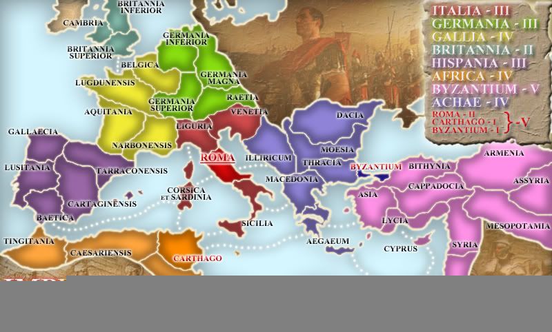
edbeard wrote:Byzantium (the city) is part of both the Achea and Byzantium continents correct?
Err... No. Its blue, so just part of Achaia. I thought it was obvious... I spread it over the sea crossing so as to make the fact that you can attack from Byzantium to Bithynia clearer, and in the latest update I've widened the sea crossing between Thracia and Asia so as to show that you cannot attack at that crossing.
qwert wrote:Can i ask you something?What is porpose for you to open these Political topic in ConquerClub? Why you mix politic with Risk? Why you not open topic like HOT AND SEXY,or something like that.
-
Guiscard
- Posts: 4103
- Joined: Fri Dec 08, 2006 7:27 pm
- Location: In the bar... With my head on the bar
![]() by Guiscard on Fri Jun 01, 2007 4:21 pm
by Guiscard on Fri Jun 01, 2007 4:21 pm
Update time:
Toned down the colours and the glow on the borders further. Is this enough or do we need more?
Have gone over the Islands with a thinner brush as as to try and make them less deformed. I think it does look significantly better... Opinions?
Also added a graphic to the bottom right, but I'm still out of luck finding a suitable eagle to fit the graphical style of the other prints...
qwert wrote:Can i ask you something?What is porpose for you to open these Political topic in ConquerClub? Why you mix politic with Risk? Why you not open topic like HOT AND SEXY,or something like that.
-
Guiscard
- Posts: 4103
- Joined: Fri Dec 08, 2006 7:27 pm
- Location: In the bar... With my head on the bar


![]() by Ruben Cassar on Fri Jun 01, 2007 5:09 pm
by Ruben Cassar on Fri Jun 01, 2007 5:09 pm
That's a bald eagle not a Roman Aquila. While the Americans copied the use of the eagle from the Romans it's not the same thing.


-

Ruben Cassar
- Posts: 2160
- Joined: Thu Nov 16, 2006 6:04 am
- Location: Civitas Invicta, Melita, Evropa


![]() by Ruben Cassar on Fri Jun 01, 2007 5:12 pm
by Ruben Cassar on Fri Jun 01, 2007 5:12 pm
Guiscard wrote:Update time:
Toned down the colours and the glow on the borders further. Is this enough or do we need more?
Have gone over the Islands with a thinner brush as as to try and make them less deformed. I think it does look significantly better... Opinions?
Also added a graphic to the bottom right, but I'm still out of luck finding a suitable eagle to fit the graphical style of the other prints...
It's already looking better Guiscard but maybe you need to tone down the glow more. The islands are better. Thanks for adding my beloved Melita!
I have a problem with your graphic at the bottom though...it doesn't seem to be loading.
Also may I suggest adding a laurel leaves crown on the G of Guiscard when you make your signature?
Edit: I've still got a problem distinguishing between the colours of Gallia and Germania. Would it be possible to place a different colour instead of one of them?
Last edited by Ruben Cassar on Fri Jun 01, 2007 5:22 pm, edited 1 time in total.
-
Ruben Cassar
- Posts: 2160
- Joined: Thu Nov 16, 2006 6:04 am
- Location: Civitas Invicta, Melita, Evropa

![]() by Gwalchmai on Fri Jun 01, 2007 6:00 pm
by Gwalchmai on Fri Jun 01, 2007 6:00 pm
Irritatingly, a lot of the shots aren't very close up but you might possibly find something useful here. Don't know if most of the pictures really fit the style of the map though.
http://www.legionxxiv.org/signum/
http://www.legionxxiv.org/signum/
-
Gwalchmai
- Posts: 35
- Joined: Sun Sep 10, 2006 3:01 pm
![]() by Guiscard on Sat Jun 02, 2007 1:07 pm
by Guiscard on Sat Jun 02, 2007 1:07 pm
Ruben Cassar wrote:Guiscard wrote:Update time:
Toned down the colours and the glow on the borders further. Is this enough or do we need more?
Have gone over the Islands with a thinner brush as as to try and make them less deformed. I think it does look significantly better... Opinions?
Also added a graphic to the bottom right, but I'm still out of luck finding a suitable eagle to fit the graphical style of the other prints...
It's already looking better Guiscard but maybe you need to tone down the glow more. The islands are better. Thanks for adding my beloved Melita!
I have a problem with your graphic at the bottom though...it doesn't seem to be loading.
Also may I suggest adding a laurel leaves crown on the G of Guiscard when you make your signature?
Edit: I've still got a problem distinguishing between the colours of Gallia and Germania. Would it be possible to place a different colour instead of one of them?
Glad the islands are better, and yes I'll tone down the glow further. The problem is that the less and less glow there is the less smooth the borders look, and taking away the glow but adding blur later is just doing the same thing at a later point.
And I think the uploading of the Jpeg went wrong somewhere, sorry.
As for the colours of Germania and Gallia, would changing the colours of Hispania and Gallia help? Or would the orange and yellow of africa and spain then look too similar?
qwert wrote:Can i ask you something?What is porpose for you to open these Political topic in ConquerClub? Why you mix politic with Risk? Why you not open topic like HOT AND SEXY,or something like that.
-
Guiscard
- Posts: 4103
- Joined: Fri Dec 08, 2006 7:27 pm
- Location: In the bar... With my head on the bar
![]() by Guiscard on Sat Jun 02, 2007 1:09 pm
by Guiscard on Sat Jun 02, 2007 1:09 pm
And thanks for the eagle picks, I'll look into adding it...
qwert wrote:Can i ask you something?What is porpose for you to open these Political topic in ConquerClub? Why you mix politic with Risk? Why you not open topic like HOT AND SEXY,or something like that.
-
Guiscard
- Posts: 4103
- Joined: Fri Dec 08, 2006 7:27 pm
- Location: In the bar... With my head on the bar
![]() by hulmey on Sat Jun 02, 2007 2:03 pm
by hulmey on Sat Jun 02, 2007 2:03 pm
the white borders look o.k. in the uk but towards spain and greece they have alot more glow and look whiter.
Think your also going to have a problem with people not knowing if they can attack from the place edbard mentioned and maybe to a smaller extent the gabraltor area.
Think your also going to have a problem with people not knowing if they can attack from the place edbard mentioned and maybe to a smaller extent the gabraltor area.
[img]http://img801.imageshack.us/img801/9761/41922610151374166770386.jpg[/mg]
-
hulmey
- Posts: 3742
- Joined: Fri Nov 03, 2006 7:33 am
- Location: Las Vegas
Return to Melting Pot: Map Ideas
Who is online
Users browsing this forum: No registered users
|
|||||||
| Conquer Club is not associated with RISK online in any way. Copyright © 2006-2025 by Big Wham LLC | |||||||