Overall the map is very busy. You have so many things going on it's all a bit much to take in. A bit too intense.
specifically I think the problem lies in the unplayable areas.
a. the water texture doesn't seem right. Yes it looks just like a picture of water (maybe this is the problem too much like a zoomed picture of a lake), but it just doesn't seem to fit in. This is especially true when you contrast it to the lakes and rivers.
b. the stone/marble whatever it is. I like it, but again too intense. The territories should be the focus on the map. Right now it seems like water, and stone with some land just thrown in.
Like people said, the bonus legend needs to be larger. I think red is worth 5.
The Persian Empire (Last On 1st Post of P12)
Moderator: Cartographers
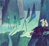
![]() by snufkin on Fri Jun 01, 2007 7:00 am
by snufkin on Fri Jun 01, 2007 7:00 am
I agree about the pictures on the sea - not so good.
You have very beatiful things going here, but the sea makes it look a little like a collage rather than a map.
The upper right relief of the unplayable lands look sharpened compared to the lower and left parts.. possible to make them more alike?
You have very beatiful things going here, but the sea makes it look a little like a collage rather than a map.
The upper right relief of the unplayable lands look sharpened compared to the lower and left parts.. possible to make them more alike?
-
 snufkin
- Posts: 206
- Joined: Sun Apr 22, 2007 7:40 am
- Location: borderland of Ranrike


![]() by RobinJ on Fri Jun 01, 2007 7:26 am
by RobinJ on Fri Jun 01, 2007 7:26 am
Map is brilliant - keep up the good work.
But there are a few problems:
1) The sea doesn't seem to quite fit with the rest map
2) Bonuses legend is too small (but you did say you would fix that so that's alright)
3) I don't think you really need to have a legend telling us what the bridges, mountains, rivers and forests are - it's a waste of space. Either remove it or just group them under impassable
nmhunate wrote:Speak English... It is the language that God wrote the bible in.
Highest Score: 2437
Highest Place: 84
-

RobinJ
- Posts: 1901
- Joined: Mon Aug 21, 2006 1:56 pm
- Location: Northern Ireland


![]() by Night2 on Fri Jun 01, 2007 8:07 am
by Night2 on Fri Jun 01, 2007 8:07 am
edbeard wrote:Overall the map is very busy. You have so many things going on it's all a bit much to take in. A bit too intense.
specifically I think the problem lies in the unplayable areas.
a. the water texture doesn't seem right. Yes it looks just like a picture of water (maybe this is the problem too much like a zoomed picture of a lake), but it just doesn't seem to fit in. This is especially true when you contrast it to the lakes and rivers.
b. the stone/marble whatever it is. I like it, but again too intense. The territories should be the focus on the map. Right now it seems like water, and stone with some land just thrown in.
Like people said, the bonus legend needs to be larger. I think red is worth 5.
I will make non-country backgraounds darker and make sea most near to the map ...
About Red bounse I said I forgot make it correct in next realese you will see it's correct ...
snufkin wrote:I agree about the pictures on the sea - not so good.
You have very beatiful things going here, but the sea makes it look a little like a collage rather than a map.
The upper right relief of the unplayable lands look sharpened compared to the lower and left parts.. possible to make them more alike?
I will not change images, but I will do some changes on their effects ...
RobinJ wrote:Map is brilliant - keep up the good work.
But there are a few problems:
1) The sea doesn't seem to quite fit with the rest map
2) Bonuses legend is too small (but you did say you would fix that so that's alright)
3) I don't think you really need to have a legend telling us what the bridges, mountains, rivers and forests are - it's a waste of space. Either remove it or just group them under impassable
1) Will change!
2) Yes I corrected in my computer ...
3) Yes you are right, so I will add an Impassable Borders title on them ...
-

Night2
- Posts: 206
- Joined: Sun May 27, 2007 5:24 am
- Location: Darkness


![]() by Ruben Cassar on Fri Jun 01, 2007 11:06 am
by Ruben Cassar on Fri Jun 01, 2007 11:06 am
The legend is still a bit too small. Don't forget that you must make a small and a big version of the map.


-

Ruben Cassar
- Posts: 2160
- Joined: Thu Nov 16, 2006 6:04 am
- Location: Civitas Invicta, Melita, Evropa


![]() by Ruben Cassar on Fri Jun 01, 2007 11:34 am
by Ruben Cassar on Fri Jun 01, 2007 11:34 am
Night2 wrote:ok ...
Do anyone know how much is different of position that we enter for countries in XML and the real center position!?
Ask Keyogi...he knows for sure. Perhaps we should do a sticky or something about this in the relevant section (if there isn't already).
-
Ruben Cassar
- Posts: 2160
- Joined: Thu Nov 16, 2006 6:04 am
- Location: Civitas Invicta, Melita, Evropa
![]() by AndyDufresne on Fri Jun 01, 2007 1:00 pm
by AndyDufresne on Fri Jun 01, 2007 1:00 pm
Would it perhaps be possible to differentiate between Bactria and the non-playable gameboard, a little more? Due to the fact you used the color not with an interior continent, it may blend a little too much with the background. Maybe you could play with the tone of it a little? Or switch gray to an interior continent? (really that just leaves Elam..hehe)
--Andy
--Andy
-

AndyDufresne
- Posts: 24935
- Joined: Fri Mar 03, 2006 8:22 pm
- Location: A Banana Palm in Zihuatanejo


![]() by plysprtz on Fri Jun 01, 2007 1:42 pm
by plysprtz on Fri Jun 01, 2007 1:42 pm
AndyDufresne wrote:Would it perhaps be possible to differentiate between Bactria and the non-playable gameboard, a little more? Due to the fact you used the color not with an interior continent, it may blend a little too much with the background. Maybe you could play with the tone of it a little? Or switch gray to an interior continent? (really that just leaves Elam..hehe)
--Andy
its fine he has a shadowed border but whatever
1546 - top score
-

plysprtz
- Posts: 471
- Joined: Fri Mar 02, 2007 2:43 pm
- Location: chicago


![]() by pepperonibread on Fri Jun 01, 2007 9:49 pm
by pepperonibread on Fri Jun 01, 2007 9:49 pm
Two things:
1. Maybe this is just me, but it seems like the colors on the right are brighter and/or more saturated than the left. It just feels sort of off-balance.
2. I think someone has mentioned this before, but I'd make the texture on the outer unplayable land a little less bold.
Besides that, looks sweet, can't wait to play it.

-

pepperonibread
- Posts: 954
- Joined: Sun Jan 28, 2007 4:33 pm
- Location: The Former Confederacy
![]() by Night2 on Sun Jun 03, 2007 1:50 pm
by Night2 on Sun Jun 03, 2007 1:50 pm
The Map Is Completed And Needs To Test!
Large Map:

Large Map With Armies:

Small Map:

Small Map With Armies:

< - - - - - - - - - - >
[url=http://www.night2.net/conquer_club/maps/the_persian_empire.zip]Click Here To Download Full Package With XML File ...
[/url]
< - - - - - - - - - - >
Details:
- The map have 10 continents ...
- List of continents:
> > > - Bactria [Bonus: 3]
> > > > > > - Countries: [Bactra, Gandhara, Arachosia, Sattagydia]
> > > - Dahae [Bonus: 2]
> > > > > > - Countries: [Dahae, Chorasmia, Maracanda]
> > > - Aria [Bonus: 7]
> > > - > > > - Countries: [Aria, Margiana, Hyrcania, Parthia, Sarangian, Sind, Gedrosia, Maka]
> > > - Elam [Bonus: 2]
> > > > > > - Countries: [Elam, Media, Sagartia]
> > > - Pasargade [Bonus: 3]
> > > > > > - Countries: [Persepolis, Susa, Tarua, Kish]
> > > - Bisitun [Bonus: 4]
> > > > > > - Countries: [Bisitun, Babylonia, Ashur, Nineveh, Urmia]
> > > - Aemenia [Bonus: 3]
> > > - > > > - Countries: [Armenia, Colchi, Caspians, Van]
> > > - Sidon [Bonus: 1]
> > > > > > - Countries: [Sidon, Jursalem]
> > > - Eqypt [Bonus: 2]
> > > > > > - Countries: [Eqypt, Thebes, Amon, Libya]
> > > - Sardis [Bonus: 5]
> > > > > > - Countries: [Sardis, Crete, Thrace, Cilicia, Cyprus, Ancyra, Pteria]
- Total Countries: 44
- The country of Elam in Elam starts with 9 neutral armies ...
- The country of Jursalem in Sidon starts with 6 neutral armies ...
< - - - - - - - - - - >
If there is any problem in Image files or XML file, please let me know ...
Thanks from everyone helped and supported me to making this map ...
Good Luck ...
Large Map:
Large Map With Armies:
Small Map:
Small Map With Armies:
< - - - - - - - - - - >
[url=http://www.night2.net/conquer_club/maps/the_persian_empire.zip]Click Here To Download Full Package With XML File ...
[/url]
< - - - - - - - - - - >
Details:
- The map have 10 continents ...
- List of continents:
> > > - Bactria [Bonus: 3]
> > > > > > - Countries: [Bactra, Gandhara, Arachosia, Sattagydia]
> > > - Dahae [Bonus: 2]
> > > > > > - Countries: [Dahae, Chorasmia, Maracanda]
> > > - Aria [Bonus: 7]
> > > - > > > - Countries: [Aria, Margiana, Hyrcania, Parthia, Sarangian, Sind, Gedrosia, Maka]
> > > - Elam [Bonus: 2]
> > > > > > - Countries: [Elam, Media, Sagartia]
> > > - Pasargade [Bonus: 3]
> > > > > > - Countries: [Persepolis, Susa, Tarua, Kish]
> > > - Bisitun [Bonus: 4]
> > > > > > - Countries: [Bisitun, Babylonia, Ashur, Nineveh, Urmia]
> > > - Aemenia [Bonus: 3]
> > > - > > > - Countries: [Armenia, Colchi, Caspians, Van]
> > > - Sidon [Bonus: 1]
> > > > > > - Countries: [Sidon, Jursalem]
> > > - Eqypt [Bonus: 2]
> > > > > > - Countries: [Eqypt, Thebes, Amon, Libya]
> > > - Sardis [Bonus: 5]
> > > > > > - Countries: [Sardis, Crete, Thrace, Cilicia, Cyprus, Ancyra, Pteria]
- Total Countries: 44
- The country of Elam in Elam starts with 9 neutral armies ...
- The country of Jursalem in Sidon starts with 6 neutral armies ...
< - - - - - - - - - - >
If there is any problem in Image files or XML file, please let me know ...
Thanks from everyone helped and supported me to making this map ...
Good Luck ...
-
Night2
- Posts: 206
- Joined: Sun May 27, 2007 5:24 am
- Location: Darkness
![]() by johloh on Sun Jun 03, 2007 2:10 pm
by johloh on Sun Jun 03, 2007 2:10 pm
did you just say the map is finished? because you dont really decide that...
some ideas...
-bridges shouldnt be in the legend with 'impassable borders' as they are the opposite.
-i dont like the graphic in the space next to ashur, sidon, and jursalem.
-is it supposed to be spelled jursalem?
-i think you should remove the black shadows that border the rivers where they hit the sea...it should be straight blue to blue...
-should the river in sardis flow somewhere? its landlocked...maybe add a bridge and flow it into a body of water? you have a lot of other rivers that are landlocked too...is this accurate?
-id increase the font in the legend, you have plenty of room up there...
my new site - http://www.spritestitch.com/ - A video game craft weblog...
-

johloh
- Posts: 472
- Joined: Mon Dec 04, 2006 12:58 pm
- Location: San Francisco

![]() by Night2 on Sun Jun 03, 2007 2:27 pm
by Night2 on Sun Jun 03, 2007 2:27 pm
johloh wrote:did you just say the map is finished? because you dont really decide that...
I'm sorry but I asked many times for ideas ... there was not more!
johloh wrote:some ideas...
-bridges shouldnt be in the legend with 'impassable borders' as they are the opposite.
-i dont like the graphic in the space next to ashur, sidon, and jursalem.
-is it supposed to be spelled jursalem?
-i think you should remove the black shadows that border the rivers where they hit the sea...it should be straight blue to blue...
-should the river in sardis flow somewhere? its landlocked...maybe add a bridge and flow it into a body of water? you have a lot of other rivers that are landlocked too...is this accurate?
-id increase the font in the legend, you have plenty of room up there...
- about bridges yes
- about that background near ashur and... that's personal idea, but if there be more ideas about it, I will change it ...
- you said "is it supposed to be spelled jursalem?" can you explain more!? I didn't understand your meaning ...
- about rivers to seas will do ...
- about Sardis river, it goes to a small lake in center of Cilicia ... I thinked if I use more bridges and rivers, the map will be very busy as some bodies said that ...
- about leggend, ok I will make it again bigger ...
Also I need to help of someone to test and check the XML file, please ...
-
Night2
- Posts: 206
- Joined: Sun May 27, 2007 5:24 am
- Location: Darkness


![]() by Ruben Cassar on Sun Jun 03, 2007 2:58 pm
by Ruben Cassar on Sun Jun 03, 2007 2:58 pm
You have another spelling mistake, it should be Bactria not Bactra.
-
Ruben Cassar
- Posts: 2160
- Joined: Thu Nov 16, 2006 6:04 am
- Location: Civitas Invicta, Melita, Evropa
![]() by edbeard on Sun Jun 03, 2007 3:07 pm
by edbeard on Sun Jun 03, 2007 3:07 pm
I'd remove the 'Completed' from the thread title. It's a bit presumptuous of you.
Like people said, the bonus legend needs increase in size. I'd say double if possible. Maybe move the top left over so you can move the bottom part upwards.
I'd also do something about your army circles. There's an thread called Army Circles, I think, with circles of perfect size. I noticed that the circles are different sizes on the small and large map. It's a bit lazy to just resize your map and have different circle sizes. I realize it's a pain, because I've done it myself a few times, but it looks much better.
-

edbeard
- Posts: 2501
- Joined: Thu Mar 29, 2007 12:41 am


![]() by Night2 on Sun Jun 03, 2007 3:17 pm
by Night2 on Sun Jun 03, 2007 3:17 pm
edbeard wrote:I'd remove the 'Completed' from the thread title. It's a bit presumptuous of you.
Like people said, the bonus legend needs increase in size. I'd say double if possible. Maybe move the top left over so you can move the bottom part upwards.
I'd also do something about your army circles. There's an thread called Army Circles, I think, with circles of perfect size. I noticed that the circles are different sizes on the small and large map. It's a bit lazy to just resize your map and have different circle sizes. I realize it's a pain, because I've done it myself a few times, but it looks much better.
I changed title! about legend that's not possible to x2 but I made it bigger!
and about army circles if I want make them big in small image, they will go out from countries and I really really really don't like that
the last chages did:


also http://www.night2.net/conquer_club/maps ... empire.zip got updated!
-
Night2
- Posts: 206
- Joined: Sun May 27, 2007 5:24 am
- Location: Darkness
![]() by Steel Panzer on Sun Jun 03, 2007 4:54 pm
by Steel Panzer on Sun Jun 03, 2007 4:54 pm

-

Steel Panzer
- Posts: 459
- Joined: Sun May 13, 2007 4:24 am


![]() by DiM on Sun Jun 03, 2007 5:44 pm
by DiM on Sun Jun 03, 2007 5:44 pm
the bonus number for pasargade should be in the same column as the ones above.
“In the beginning God said, the four-dimensional divergence of an antisymmetric, second rank tensor equals zero, and there was light, and it was good. And on the seventh day he rested.”- Michio Kaku
-

DiM
- Posts: 10415
- Joined: Wed Feb 14, 2007 6:20 pm
- Location: making maps for scooby snacks


Return to Melting Pot: Map Ideas
Who is online
Users browsing this forum: No registered users
|
|||||||
| Conquer Club is not associated with RISK online in any way. Copyright © 2006-2025 by Big Wham LLC | |||||||